跳至主要內容 / Skip to content
01 — 2025–2026

JOIE 樂行|社群溝通視覺系統JOIE Taxi — Social Communication System

4 views
Year / 年份
2025–2026
Category / 類別
Social Media Design · Visual System
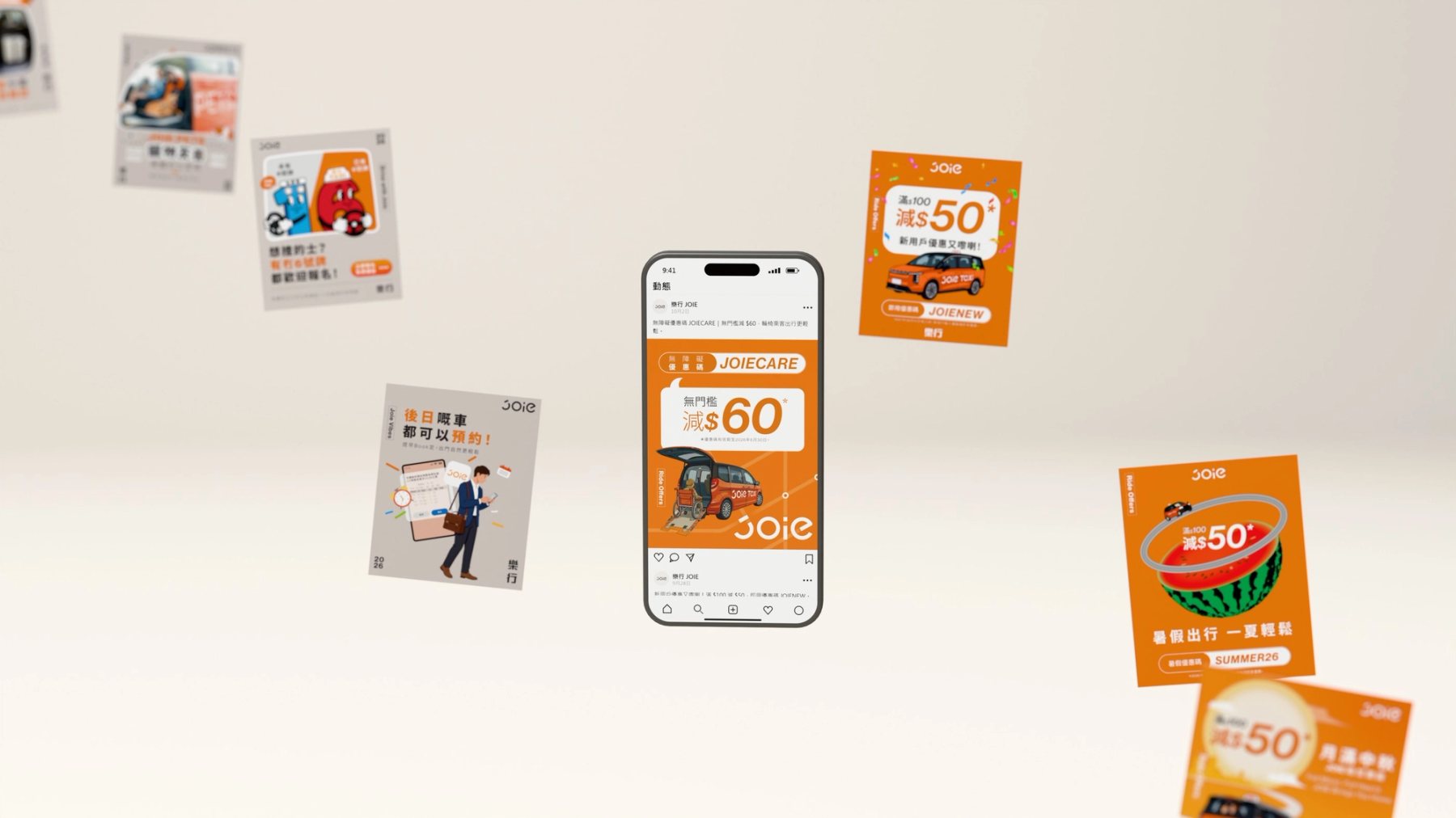
JOIE 樂行優惠貼文圍繞手機畫面展開的 3D 社群視覺系統示意。
Summary / 專案摘要

同一個社群頁面,要在優惠、司機招募、服務資訊與風雨應變之間切換。JOIE 樂行的服務面向香港乘客,也要與司機保持日常溝通。訊息的對象與緊急程度各不相同,品牌仍需要在不同情境中被認出。

設計從訊息的用途與閱讀情境出發,整理出能隨不同主題切換語氣的視覺語言。優惠需要即時辨識,服務通知需要清楚而安定,日常內容則保留與乘客對話的空間。橘色、字級層次與品牌標記讓畫面持續保有 JOIE 的辨識度。案例中的立體場景用來拆解與檢視這套設計,屬於作品集視覺化呈現。

JOIE's social page moves between offers, driver recruitment, service information and weather-related updates. The Hong Kong taxi service speaks to passengers and drivers in different circumstances. The audience and urgency change; the brand still needs to be recognisable.

The visual language responds to each message's purpose and reading context. Offers need immediate recognition, service notices call for clarity and calm, and everyday content has room for a warmer voice. Orange, type hierarchy and recurring brand marks hold these shifts together. The spatial scenes are portfolio visualisations used to examine the design.

Role / 角色
  • 社群視覺系統規劃Social Visual System
  • 內容分類與版式設計Content Architecture & Layout
  • 作品集 3D 視覺化Portfolio 3D Visualisation
Scope / 範疇
  • Facebook 社群貼文Facebook Social Posts
  • 乘客、司機與品牌內容Passenger, Driver & Brand Content
  • 社群設計規則與案例呈現Social Design Rules & Case Presentation
Goals / 設計目標
  • 01讓乘客與司機訊息各有清楚入口Clear Signals for Passengers and Drivers
  • 02讓優惠、服務與警示各有清楚語氣Distinct Voices for Offers, Services & Alerts
  • 03讓持續更新的內容維持品牌辨識Keep the Brand Recognisable as Content Evolves
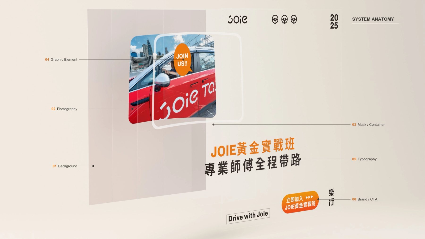
JOIE 司機招募貼文拆成背景、照片、文字與標籤等視覺層。
Fig.01招募內容拆成影像、文字、品牌標記與行動訊息,檢查各層如何在同一版面上協作。Recruitment content is separated into image, type, brand marks and calls to action to inspect each layer's role.
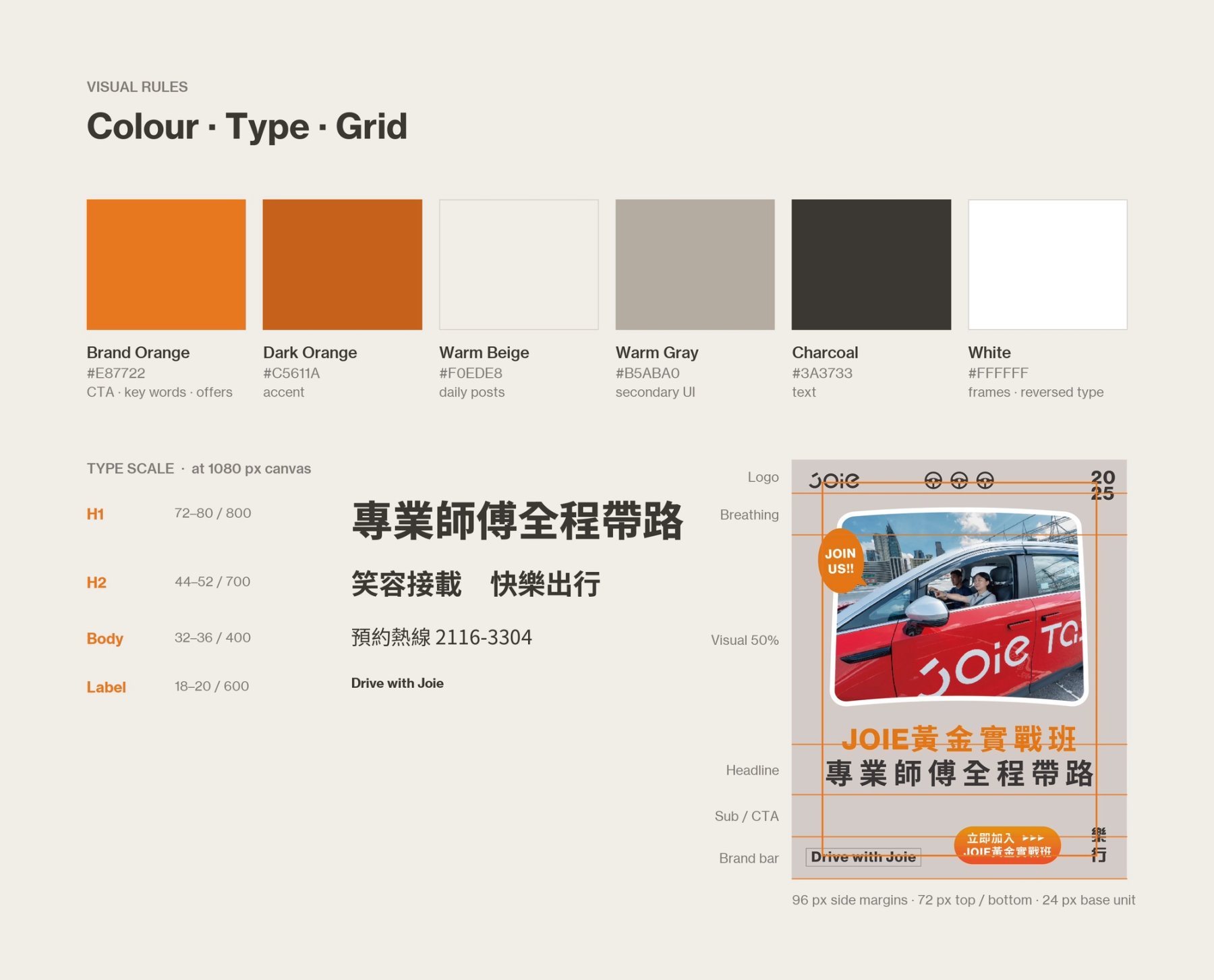
JOIE 視覺規則展示品牌色彩、字體層級與排版參考。
Fig.02色彩、文字與對齊關係共同建立品牌辨識,讓不同主題仍有一致的閱讀感受。Colour, type and alignment keep the brand recognisable across different subjects.
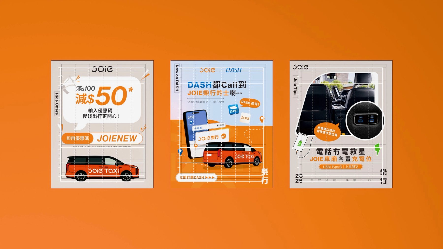
JOIE 優惠、合作與服務貼文上疊加透明排版參考線。
Fig.03不同主題沿用相同的排版關係,內容能變,閱讀的起點保持穩定。Different subjects share the same alignment while the content changes.
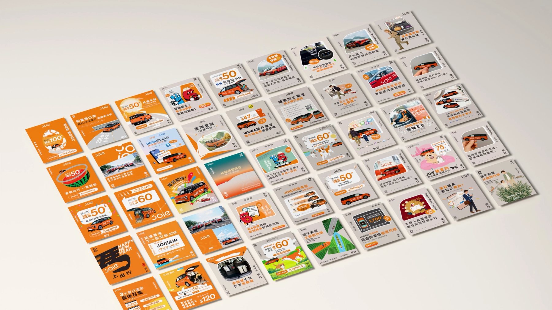
JOIE 社群貼文按橘色優惠到日常服務內容排列的 3D 總覽。
Fig.04從優惠到服務與日常內容,橘色與低彩度背景安排了閱讀節奏。Orange and quieter backgrounds set a reading rhythm from offers to everyday service.
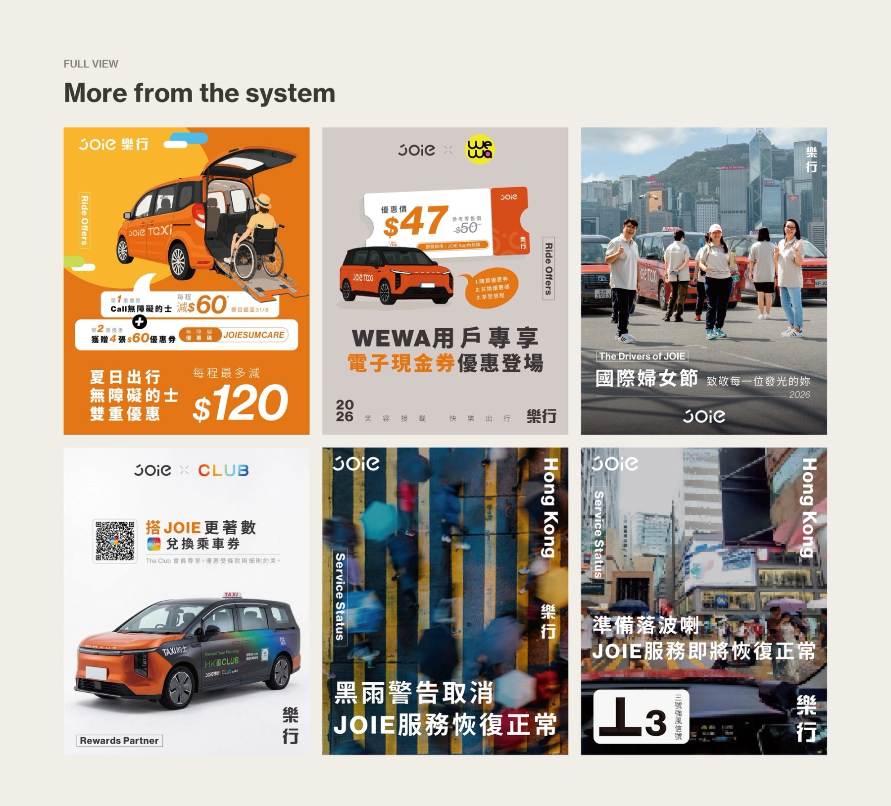
JOIE 不同主題的社群貼文原稿並列展示。
Fig.05原稿同框檢視:題材與圖像各異,品牌標記與資訊層級仍可辨認。Original artworks vary in subject while brand marks and hierarchy remain recognisable.
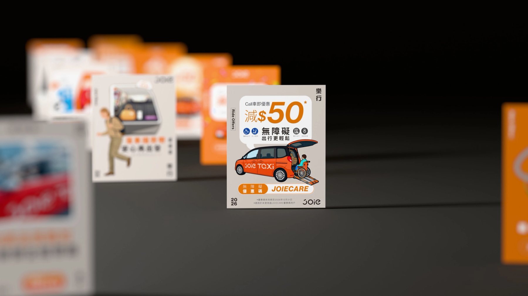
多則 JOIE 貼文沿黑色空間依序排列,焦點落在優惠內容。
Fig.06卡片被拉開距離,檢視系列內容由遠至近的辨識順序。Spacing the cards apart tests how the series reads from distance to detail.
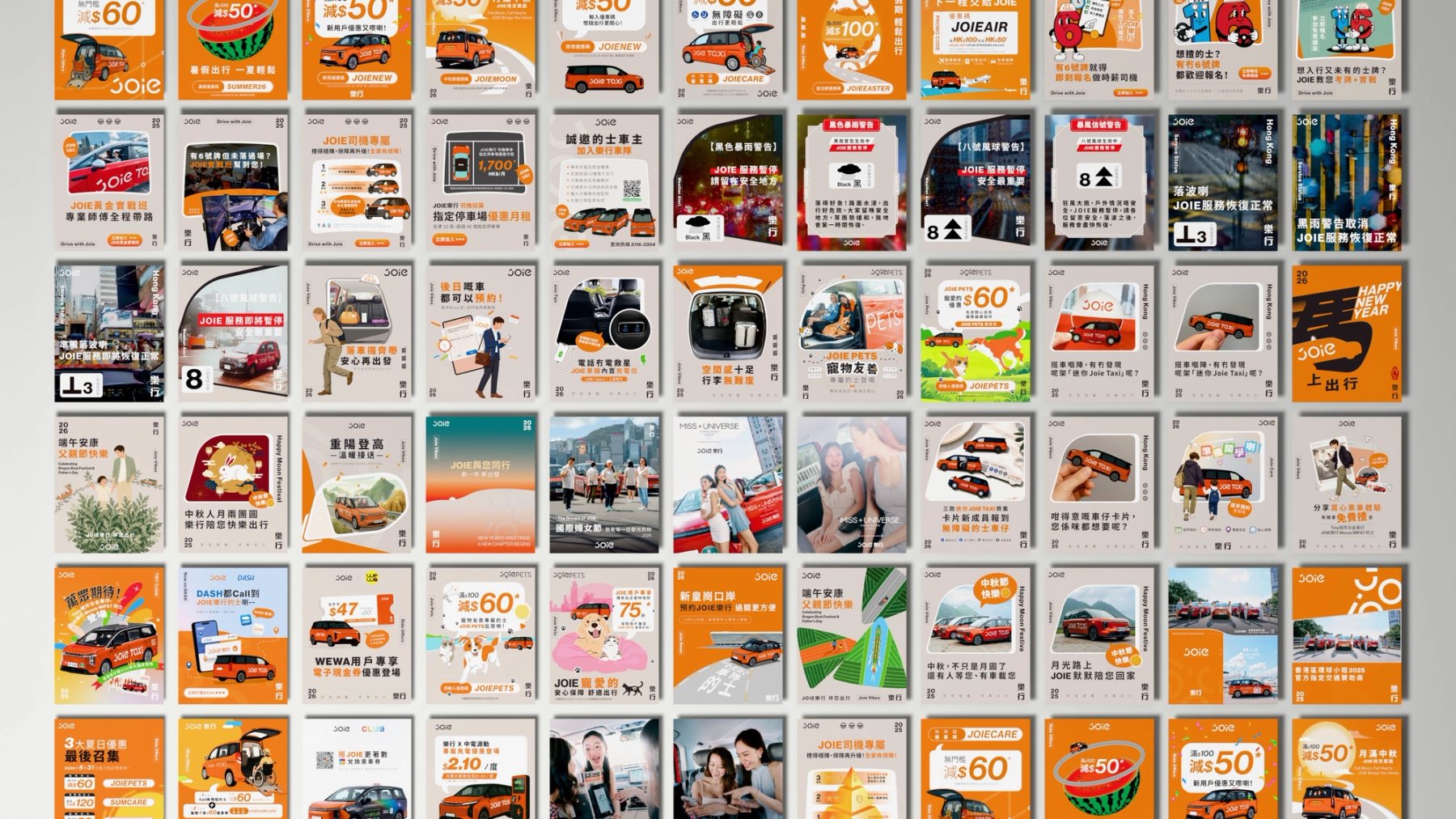
JOIE 社群貼文構成的視覺總覽。
Fig.07多種內容並置,檢查跨主題的色彩關係與整體一致性。The overview reveals colour balance and consistency across different subjects.
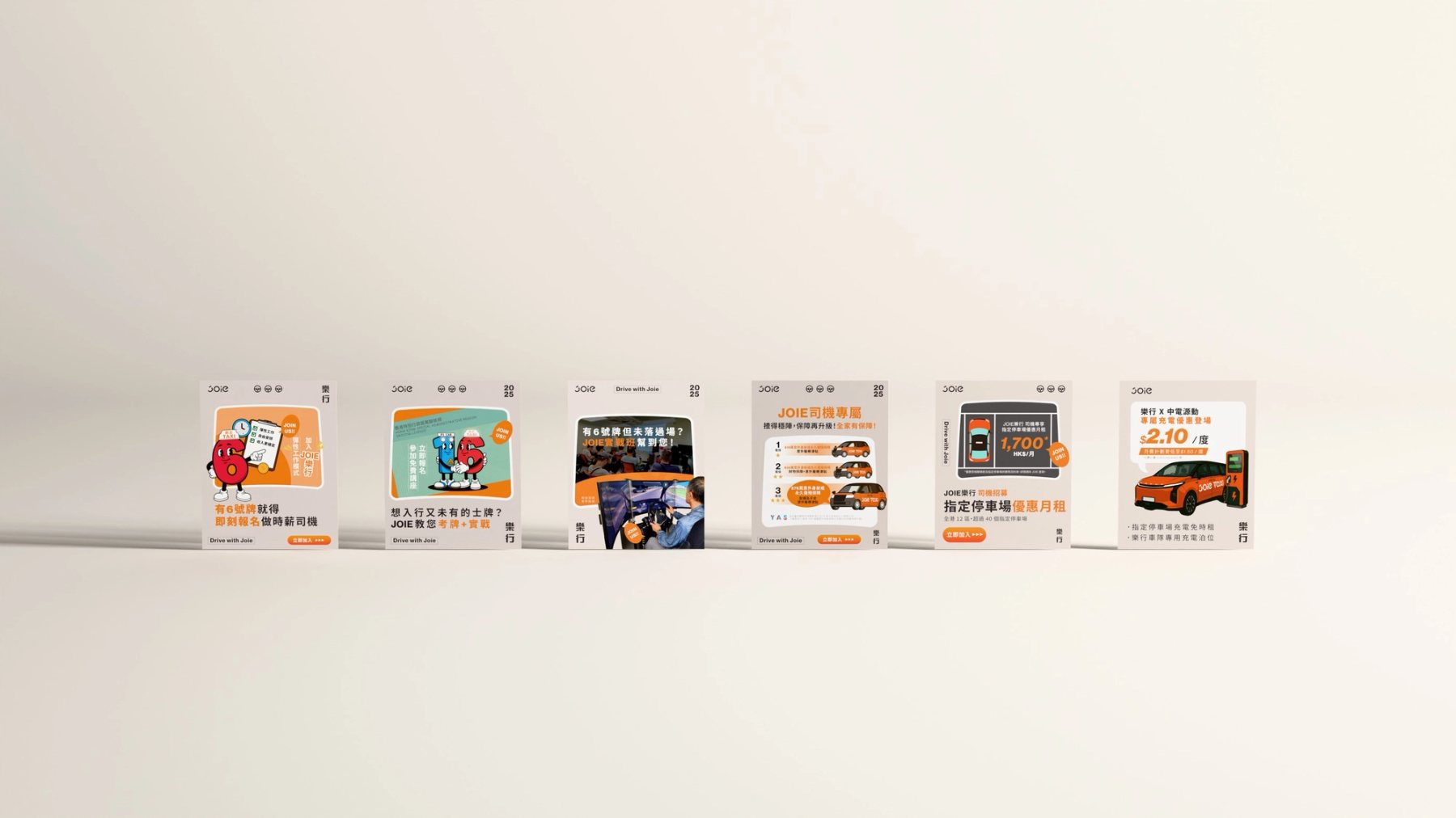
JOIE 司機招募與服務資訊貼文並列的 3D 展示。
Fig.08招募與司機資訊形成連續系列;共同版式讓不同訊息可以並排閱讀。Recruitment and driver information form a sequence through a shared layout.
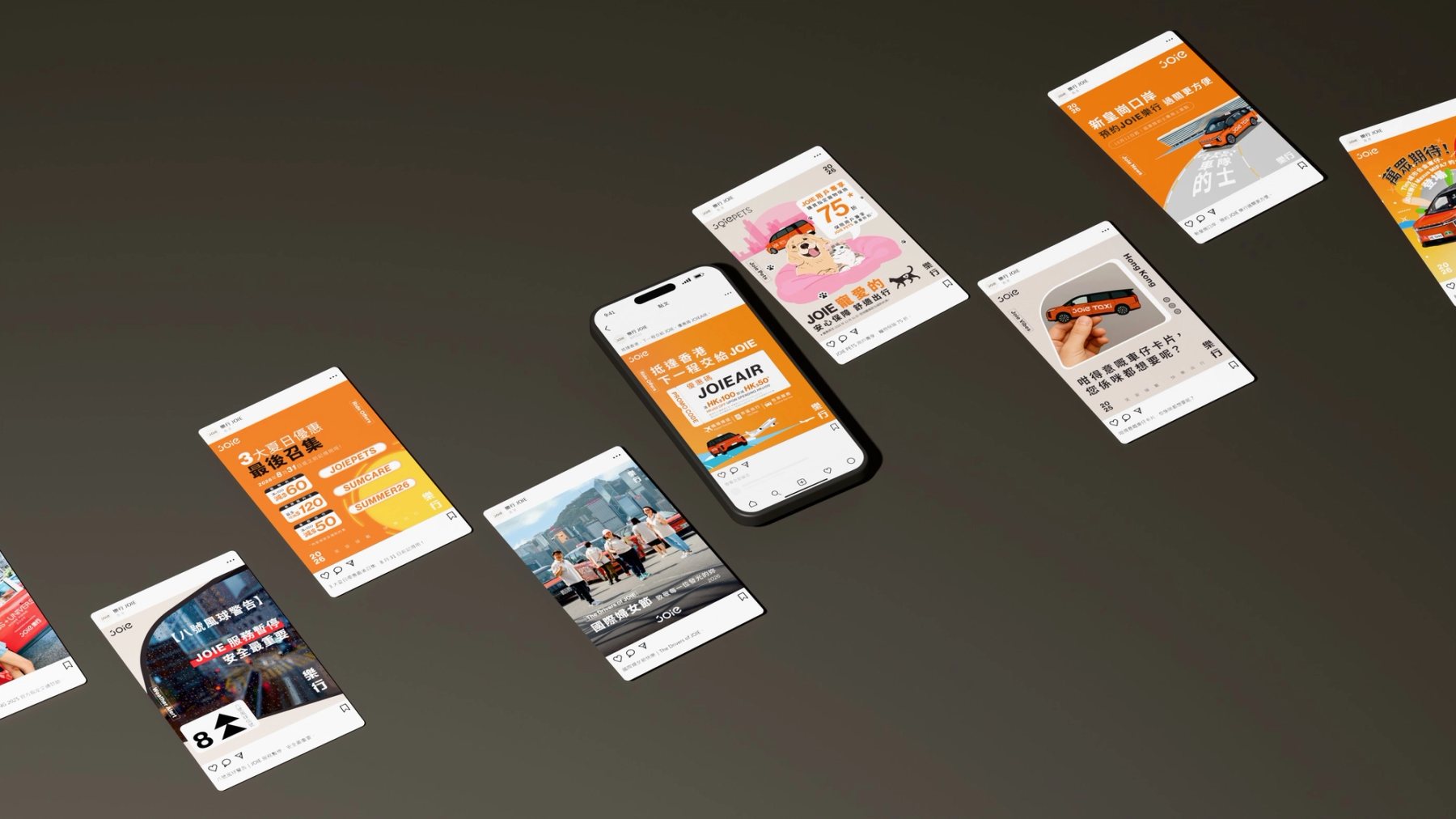
JOIE 社群貼文與手機介面卡片排列的 3D 作品集示意。
Fig.09將貼文放回模擬的觀看情境,觀察畫面縮小後標題、色彩與品牌標記的可讀性。Simulated viewing contexts test type, colour and brand recognition at smaller scale.
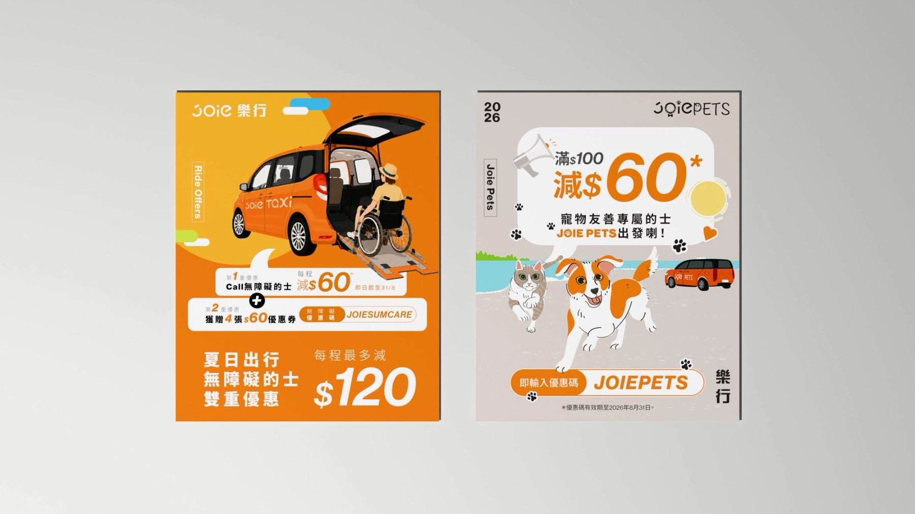
JOIE 無障礙乘車與寵物乘車優惠貼文並列。
Fig.10不同服務優惠面對不同乘客,仍以清楚的資訊次序說明服務與條件。Different offers address different passengers through a clear information order.
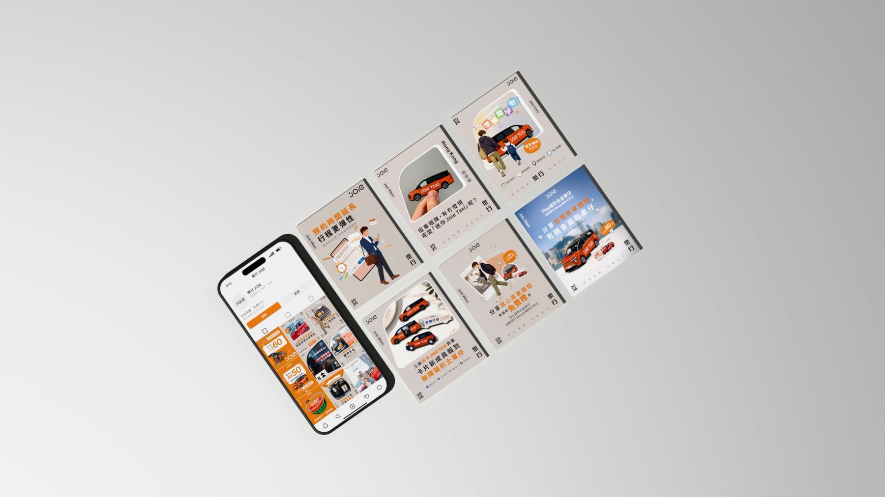
JOIE 手機專頁與服務貼文沿對角線排列。
Fig.11服務說明與乘車提示並列,顯示固定框架如何承接多種日常訊息。Service notes and ride tips share a consistent frame across everyday subjects.
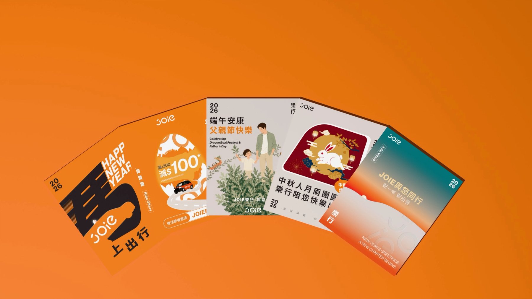
JOIE 新年、復活節、端午、中秋與品牌祝福貼文扇形展開。
Fig.12節慶內容可以改變影像與語氣,品牌的橘色與固定標記維持系列關係。Festive imagery changes with the occasion while orange and recurring marks hold the series together.
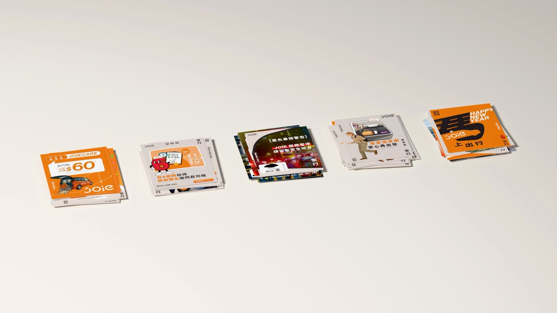
JOIE 優惠、招募、服務、日常與節慶貼文分組堆疊。
Fig.13優惠、招募、服務與節慶內容仍屬同一品牌語言,也保留各自的用途。Offers, recruitment, service and festive content share one brand language while keeping distinct purposes.