← All Works / 全部作品15 / 16
15 — 2021
玖仰杯身設計提案JIU YANG — Cup Design Proposal
24 views
- Year / 年份
- 2021
- Category / 類別
- Branding · Product · Packaging
- Role / 角色
- 品牌識別與包裝設計Brand & Packaging
- 視覺語言建立與應用Visual Identity System
- 材質與色彩規劃Material & Color
- Scope / 範疇
- 杯型結構與尺寸規劃Cup Structure
- 圖像與排版系統應用Graphic System
- 材質與環保考量Material Solution
Summary / 專案摘要
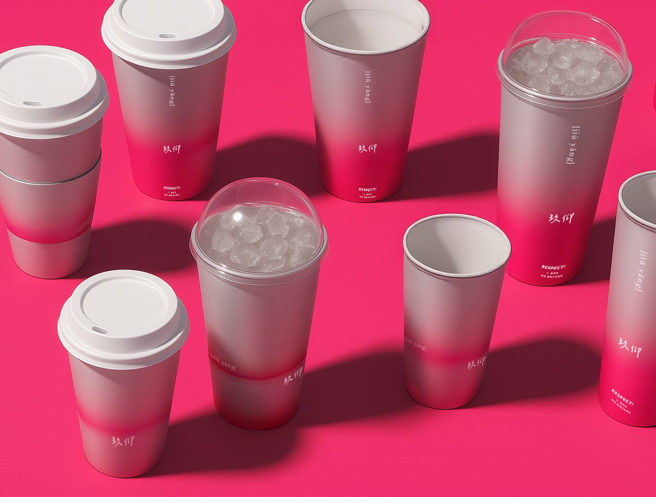
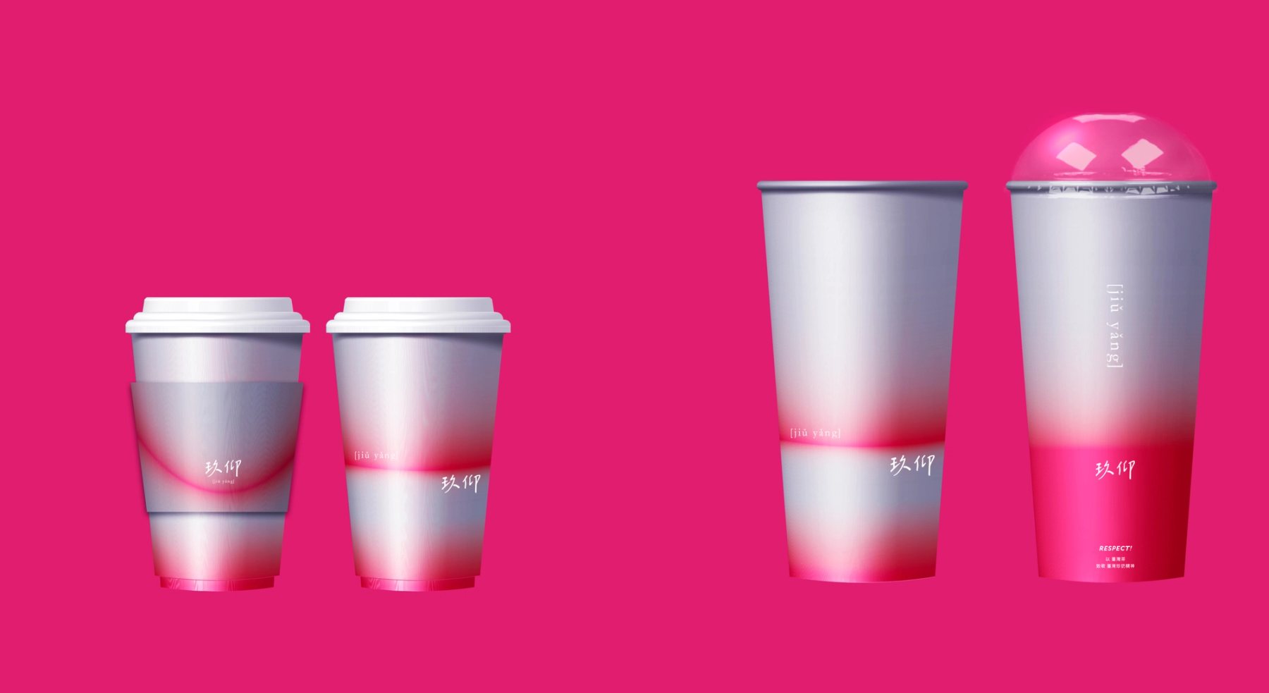
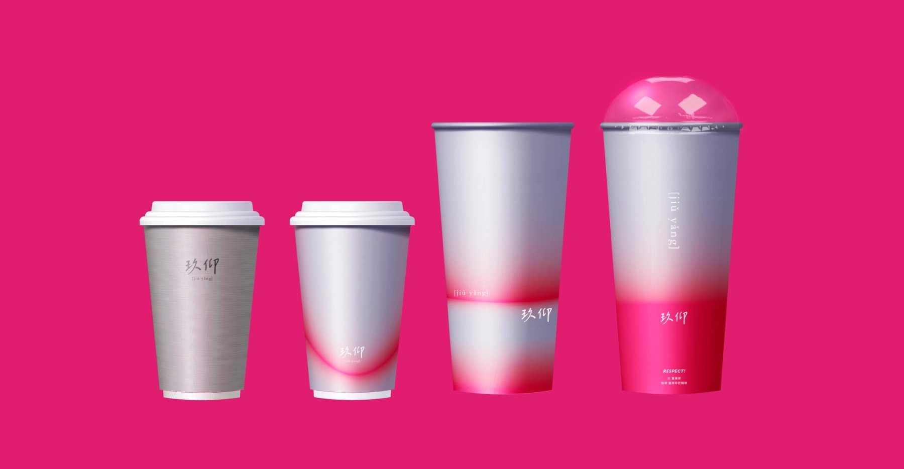
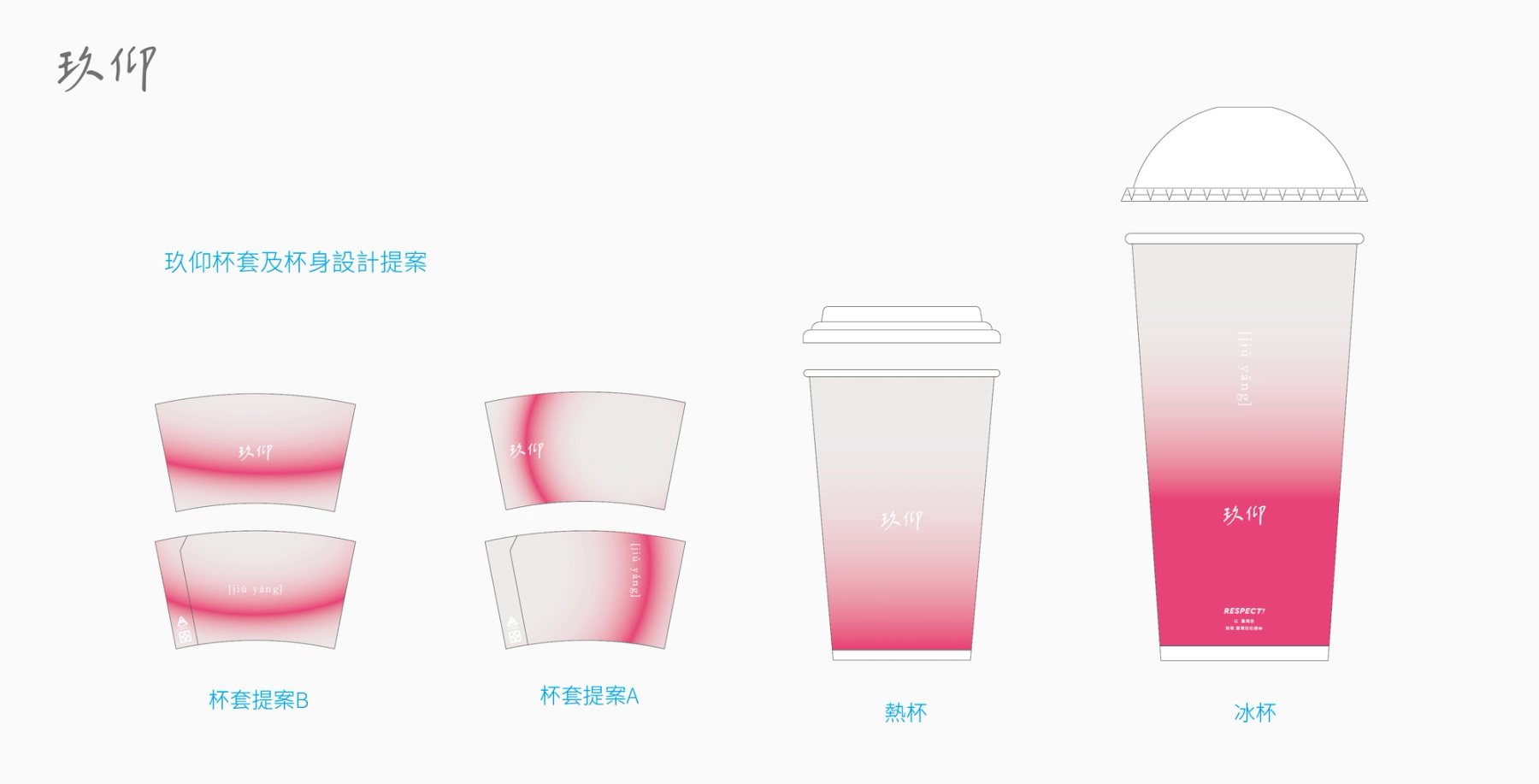
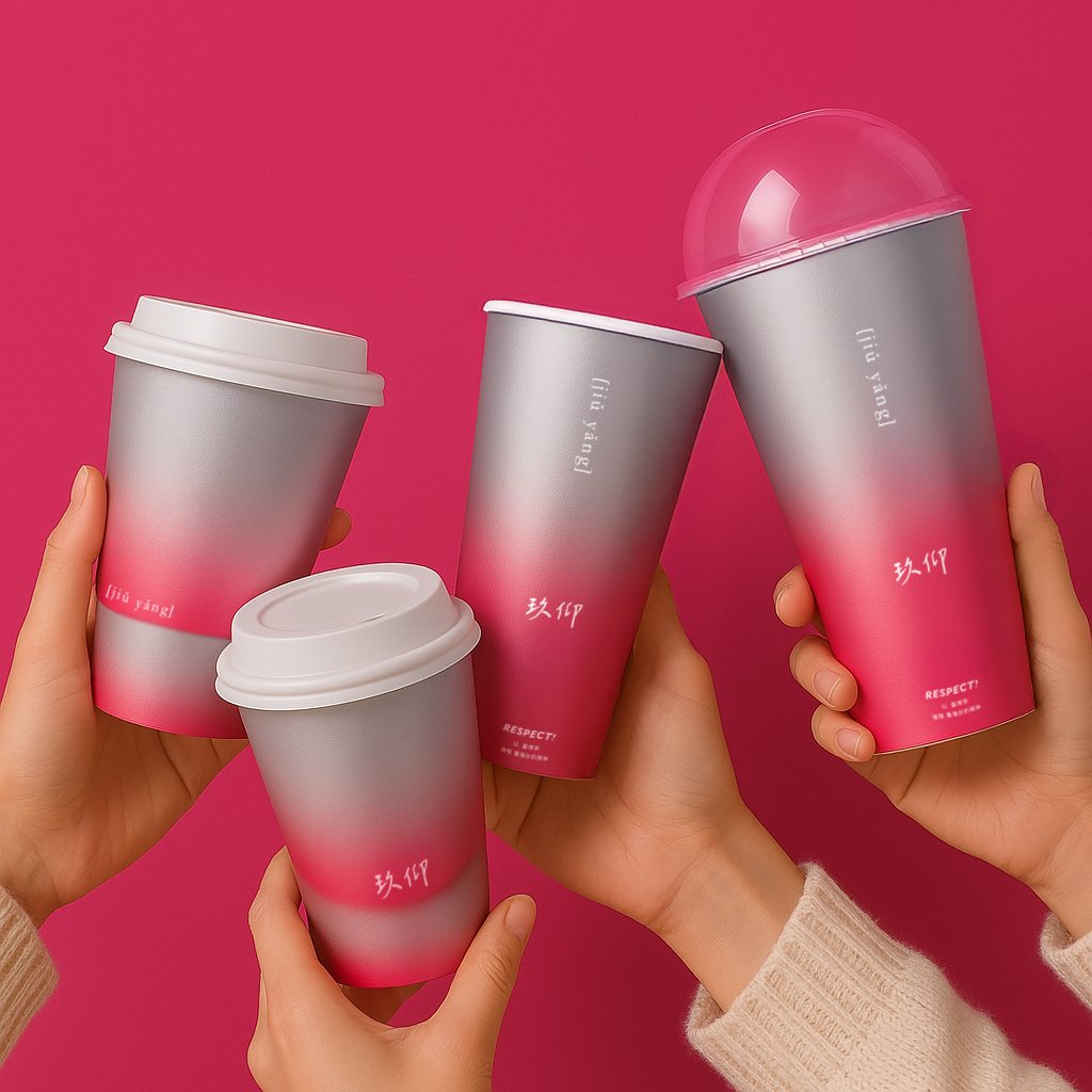
為玖仰打造外帶杯系列設計,以灰粉漸層打造高辨識度的視覺風格,呈現飲品口味層次與都會氣息。
極簡字體排版與俐落杯型提升手感、陳列視覺與品牌辨識。
Designed for Respect, this to-go cup series uses a gray–pink gradient to create a distinctive brand look inspired by beverage flavor layers and urban lifestyle. Minimal typography and refined proportions enhance grip comfort, shelf appeal, and brand visibility.
- Role / 角色
- 品牌識別與包裝設計Brand & Packaging
- 視覺語言建立與應用Visual Identity System
- 材質與色彩規劃Material & Color
- Scope / 範疇
- 杯型結構與尺寸規劃Cup Structure
- 圖像與排版系統應用Graphic System
- 材質與環保考量Material Solution
Goals / 設計目標
- 01品牌能見度提升Visibility
- 02貨架吸睛度提升Shelf Impact
- 03一致性識別建立Unified Look