跳至主要內容 / Skip to content
LUNVIA Bureau 橫 Logo

老順醬油|黑豆醬油禮盒與瓶身設計提案OLD SHUN Soy Sauce| Black Bean Soy Sauce Gift Set Design

Branding · Packaging / 202516 views
台灣伸港老順醬油品牌瓶身設計展示圖,以紅藍色調區分產品系列,展現傳統醬油文化的現代視覺

專案摘要 Summary

老順醬油以台灣伸港為基地,其品牌根源來自濕地生態與在地醬油工藝。本專案透過品牌識別重塑與包裝系統設計,凝鍊伸港獨有的風土語彙,以印章、書寫字形與色彩架構強化品牌真誠與品質形象。藉由雙系列辨識系統與送禮情境體驗,讓傳統技藝更自然地走進當代生活。 Old Shun Soy Sauce is rooted in Shengang, Taiwan—an area shaped by wetland ecology and local soy sauce craftsmanship. This project revitalizes the brand identity and packaging system with visual elements drawn from its land, including seal marks, handwritten logotypes, and a clear color structure that communicates authenticity. The dual product lineup and gifting-oriented experience bring tradition into everyday life with warmth and clarity.

專案圖片 Gallery

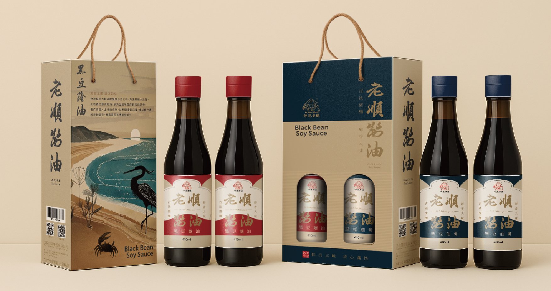
台灣伸港老順醬油系列瓶身與禮盒包裝展示,融合漁港文化與現代品牌視覺   Full product lineup and gift box packaging of Old Shun Soy Sauce, blending local fishing harbor culture with modern brand design.
以伸港海岸意象延伸的醬油品牌設計與產品體驗 A soy sauce brand experience inspired by the coastal landscape of Shengang.
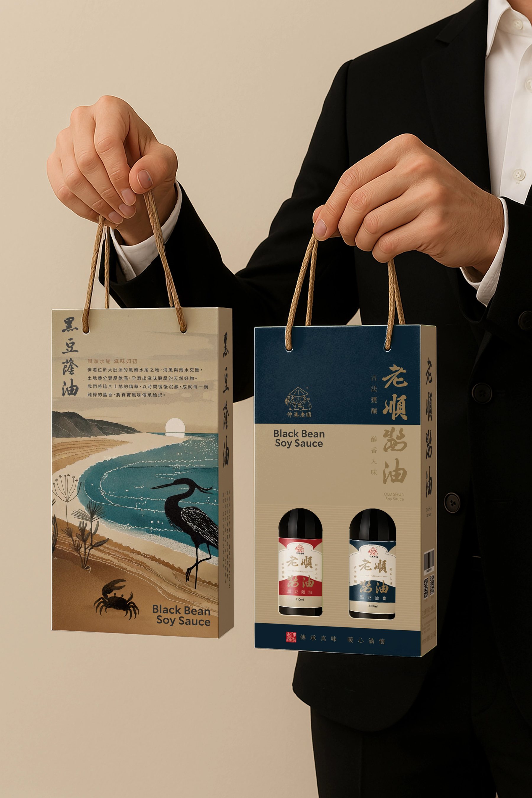
人物手持老順醬油禮盒,展示產品的送禮情境與品牌質感  A person holding Old Shun Soy Sauce gift boxes, presenting the product as a refined gifting experience.
以送禮為設計語境,讓品牌溫度隨伴手禮一同傳遞 Designed for gifting moments, carrying the warmth of the brand into every visit.
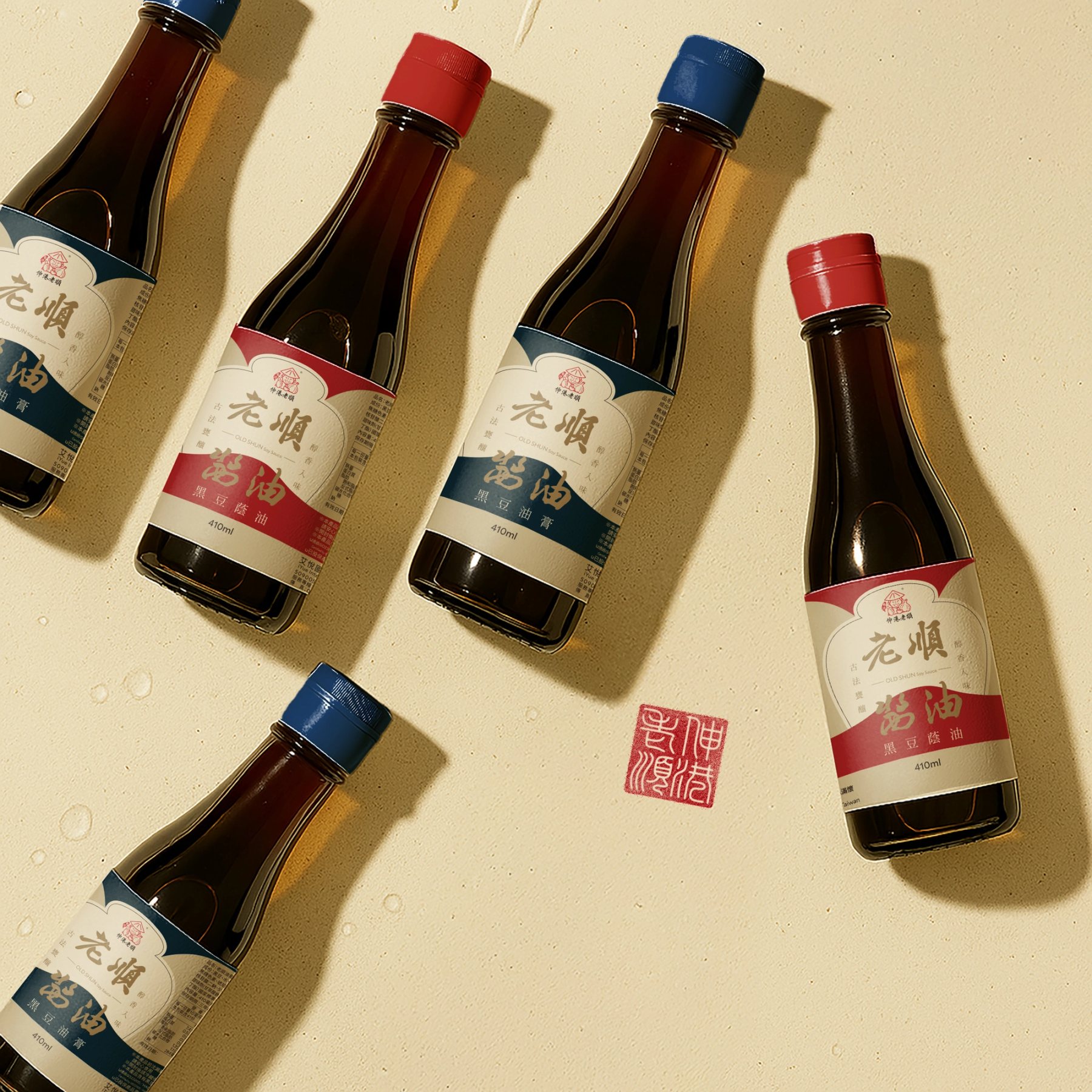
老順醬油系列瓶身近拍,以紅藍兩款視覺區分產品與品牌印章象徵品質 Close-up of Old Shun Soy Sauce bottles, featuring red and blue variants with a seal mark representing brand authenticity.
以色彩與字體系統明確區分品項,讓品牌個性一目了然 Clear product differentiation through a bold color and typography system.
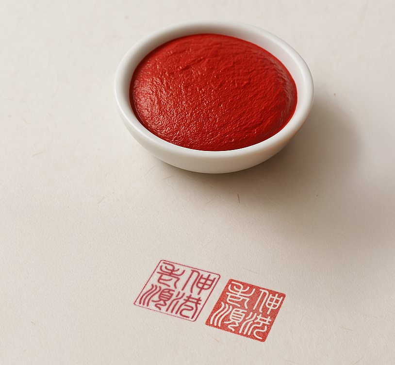
盛有朱紅印泥的小碟與蓋在桌面的品牌印章,象徵老順醬油的真實與信譽 A small dish of red seal paste with stamped brand seals, symbolizing authenticity and trust of Old Shun Soy Sauce.
以「印章」作為品牌核心符號,傳遞傳承與品質的真誠保證 A seal as a core brand symbol, conveying heritage and a promise of quality.
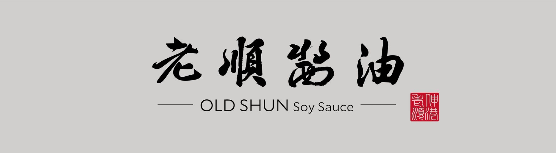
老順醬油的品牌標準字與紅色品牌印章視覺 Old Shun Soy Sauce primary brand logo with red seal mark.
書寫風格的標準字搭配印章元素,展現真誠與職人精神 A handwritten logotype paired with a traditional seal mark, expressing sincerity and craftsmanship.
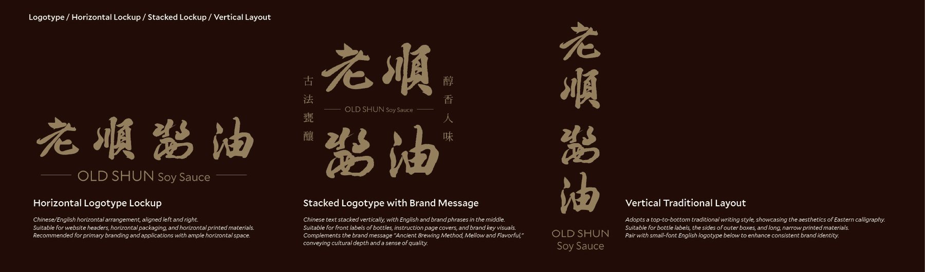
老順醬油標準字的橫式、直式與訊息增補版排版展示 Horizontal, stacked, and vertical logotype layouts of Old Shun Soy Sauce, showing system versatility.
依不同情境配置的標準字排版系統,提升品牌使用靈活度與一致性 A flexible logotype system designed for diverse applications while maintaining brand consistency.
伸港濕地意象插畫,描繪潮間帶地景與白鷺鷥象徵在地生態 Shengang wetland illustration featuring tidal landscape and a local egret.
濕地生態為品牌視覺語彙的核心來源,白鷺鷥象徵土地與職人的共生 Wetland ecology shapes the brand’s visual language, with the egret symbolizing harmony between land and craftsmanship.

角色 Role

  • 品牌識別與包裝Brand & Packaging
  • 設計系統控管Design System
  • 視覺執行協作Visual Execution
  • 策略與簡報Strategy

設計範疇 Scope

  • 識別與主視覺Identity & KV
  • 包裝系統Packaging System
  • 結構與工藝Structure & Finishing
  • 品牌應用Brand Applications

關鍵指標 KPIs

  • 辨識度提升Brand Recognition
  • 貨架吸睛度增強Shelf Visibility
  • 系統化降低成本System Efficiency
  • 送禮質感提升Premium Appeal