跳至主要內容 / Skip to content
18 — 2022

藝・啟・傳|傳統藝師紀錄光碟視覺提案Inheritance of Traditional Arts — Visual Identity & DVD Packaging Proposal

3 views
Year / 年份
2022
Category / 類別
Visual Identity · Packaging Proposal
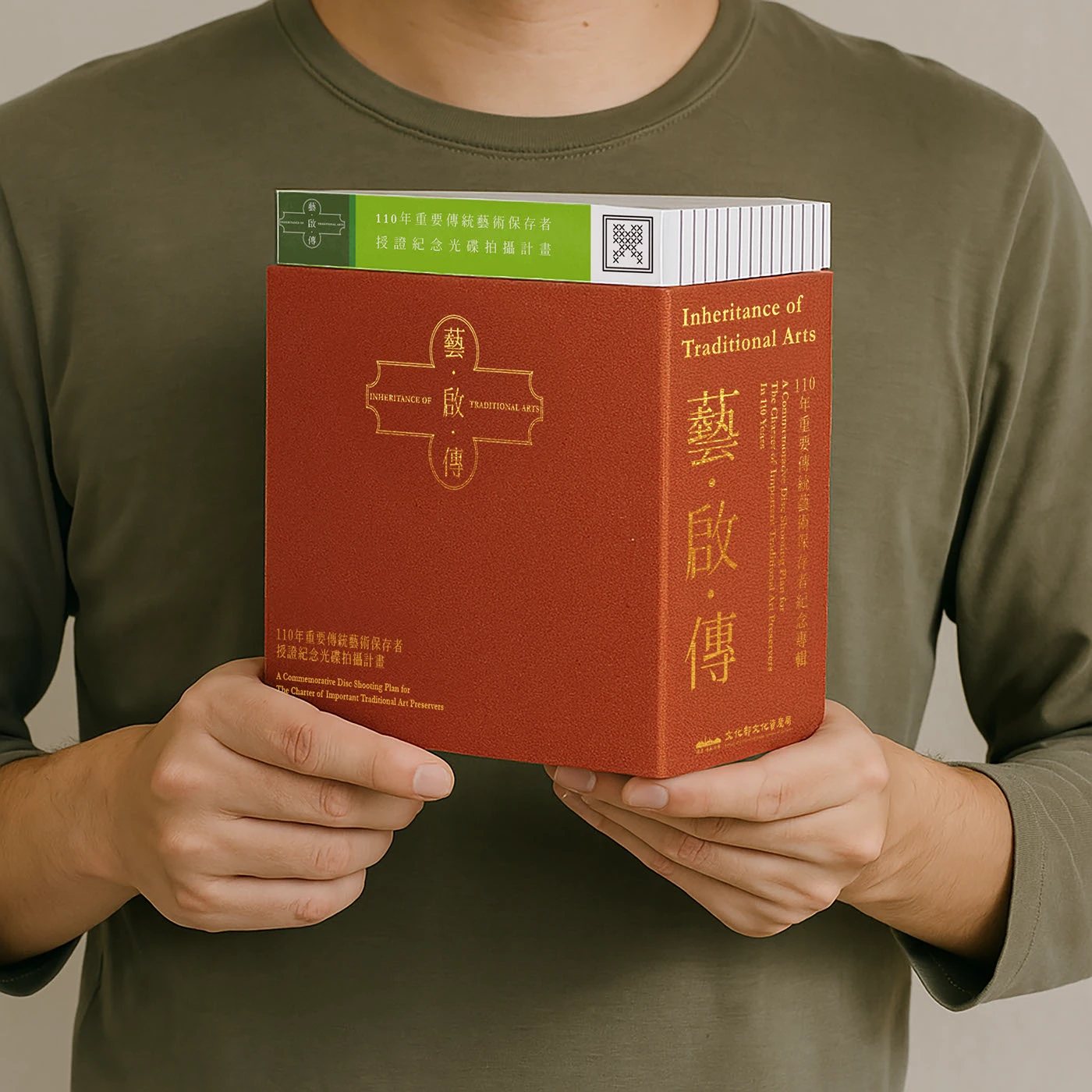
人物手持藝・啟・傳傳統藝師紀錄光碟朱紅色包裝的情境照片
Summary / 專案摘要

「藝・啟・傳」以臺灣傳統工藝藝師的影音紀錄為題,為光碟出版規劃名稱、標準字、工藝圖像與包裝。設計讓每位藝師有專屬的色彩與圖像線索,再以一致的外盒、盤面和折頁架構將它們連成一個系列。海報延伸了這套語言,讓器物與紋樣在包裝之外也能被看見。此頁呈現視覺與包裝提案。

“Inheritance of Traditional Arts” is a visual identity and DVD packaging proposal for an audiovisual archive of Taiwanese traditional craftsmen. A shared title, sleeve, disc and insert system connects the series, while colour and craft imagery give each artisan a distinct place within it. The poster designs carry those objects and patterns beyond the package.

Role / 角色
  • 主題命名與標準字設計Title Naming & Logotype
  • 工藝圖像與色彩系統Craft Imagery & Colour System
  • 光碟包裝視覺設計DVD Packaging Design
Scope / 範疇
  • 光碟外盒、盤面與折頁Sleeve, Disc & Insert
  • 系列識別與藝師分類Series Identity & Artisan Coding
  • 主題海報延伸Poster Applications
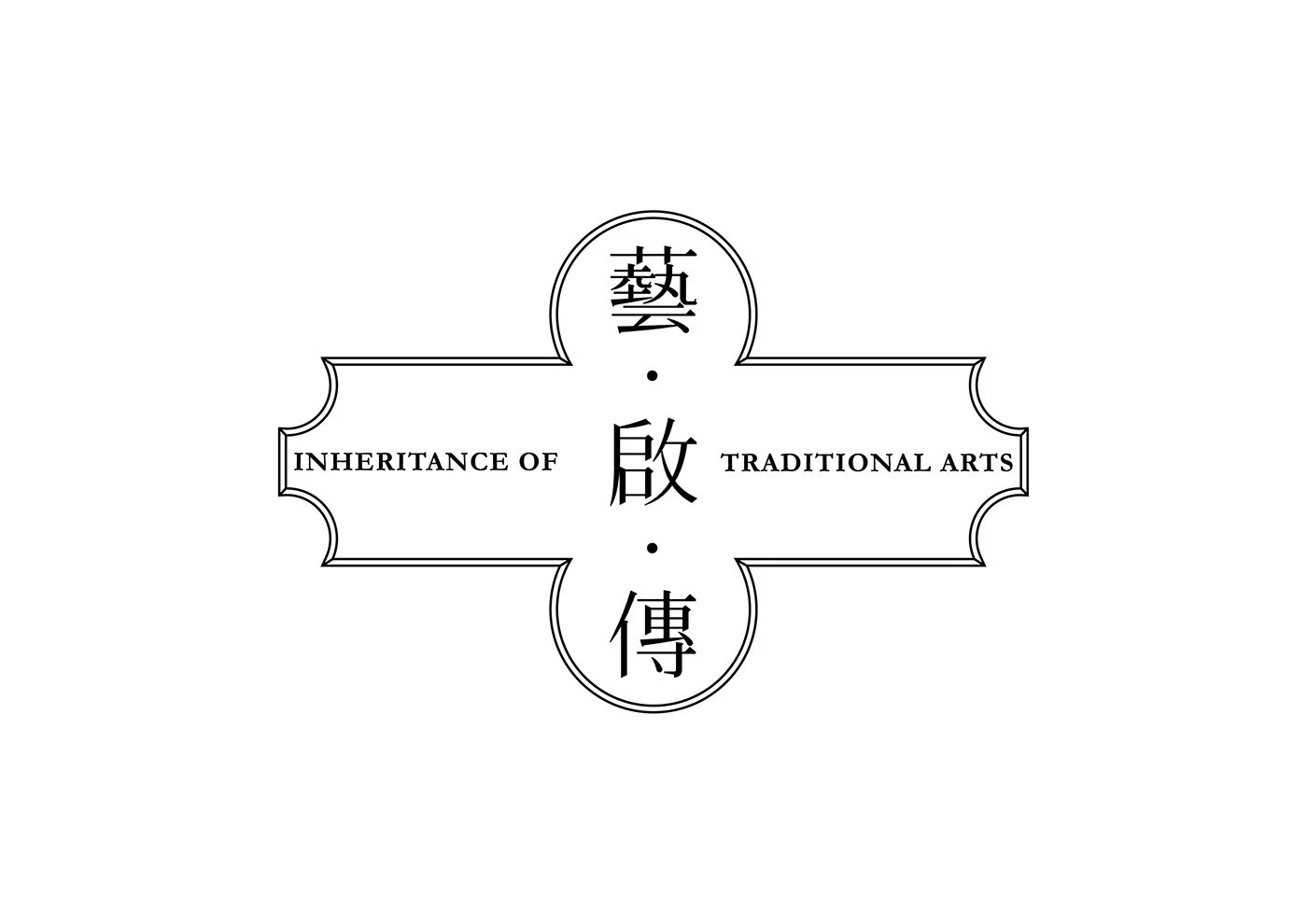
藝・啟・傳中文標準字與英文 Inheritance of Traditional Arts 的黑白設計
Fig.01「藝・啟・傳」的字形結合傳統匾額的輪廓,讓專案名稱帶出工藝傳承的份量。The title borrows the outline of a traditional signboard to give the idea of craft inheritance a visible form.
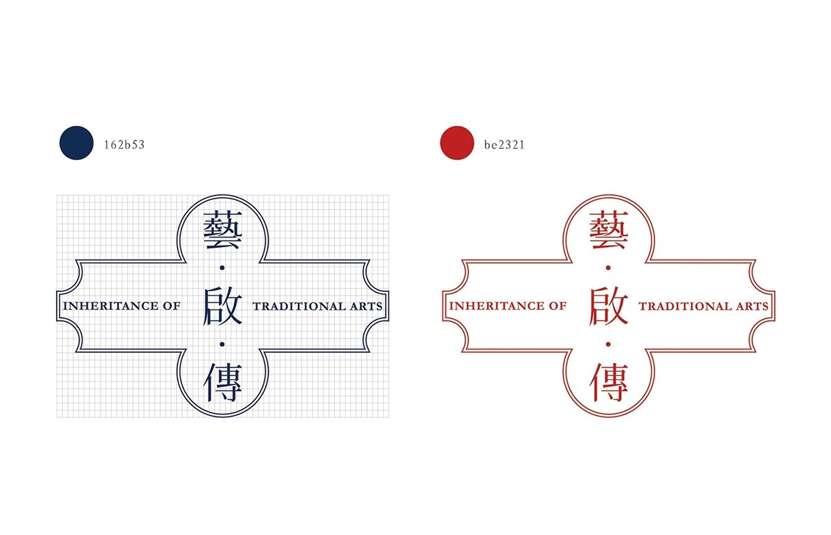
藝・啟・傳標準字的海藍與朱紅兩種配色
Fig.02海藍與朱紅讓同一組標準字呈現不同氣質,也為系列作品建立共同的起點。Navy and vermilion give the same title two distinct expressions while keeping the series together.
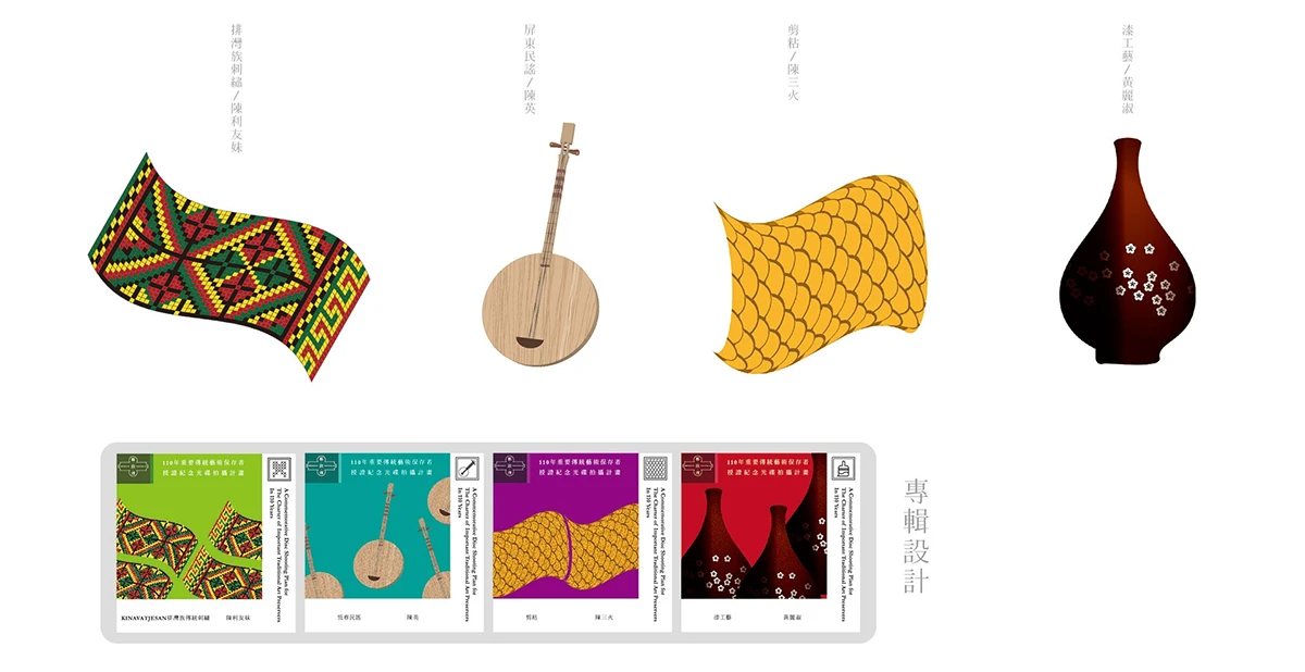
四種臺灣傳統工藝器物圖像與各色光碟包裝的系列規劃
Fig.03以不同工藝的器物與紋樣區分內容,讓每位藝師的故事有自己的畫面。Objects and patterns from different crafts give each artisan’s story its own visual identity.
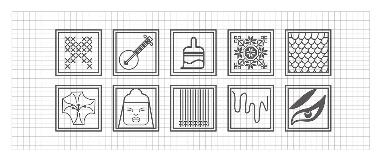
十款傳統工藝圖標的黑白線稿設計
Fig.04工藝圖標從器物與技法汲取線索,讓觀眾在閱讀名稱之前,也能先認出主題。Icons draw on tools and techniques, helping viewers recognise the subject before reading its name.
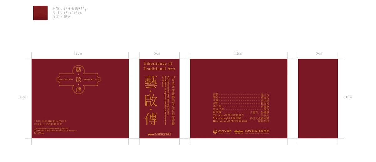
藝・啟・傳朱紅色光碟外盒展開設計稿
Fig.05朱紅色外盒把標準字放在視線焦點,展開後仍維持清楚的閱讀順序。The vermilion sleeve centres the title and keeps the information clear when opened out.
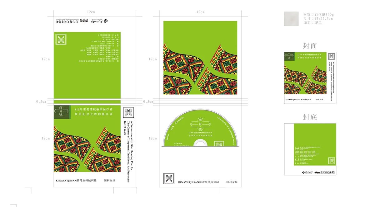
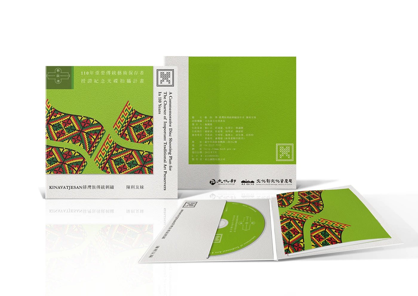
綠色傳統工藝紀錄光碟的外盒、盤面與內頁設計
Fig.06織紋延伸到外盒、盤面與內頁,讓一份紀錄從封面到觀看時都保有一致的線索。The woven pattern carries through the sleeve, disc and insert, connecting the whole viewing experience.
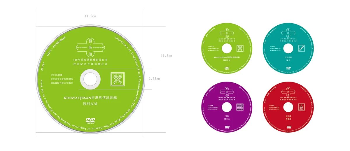
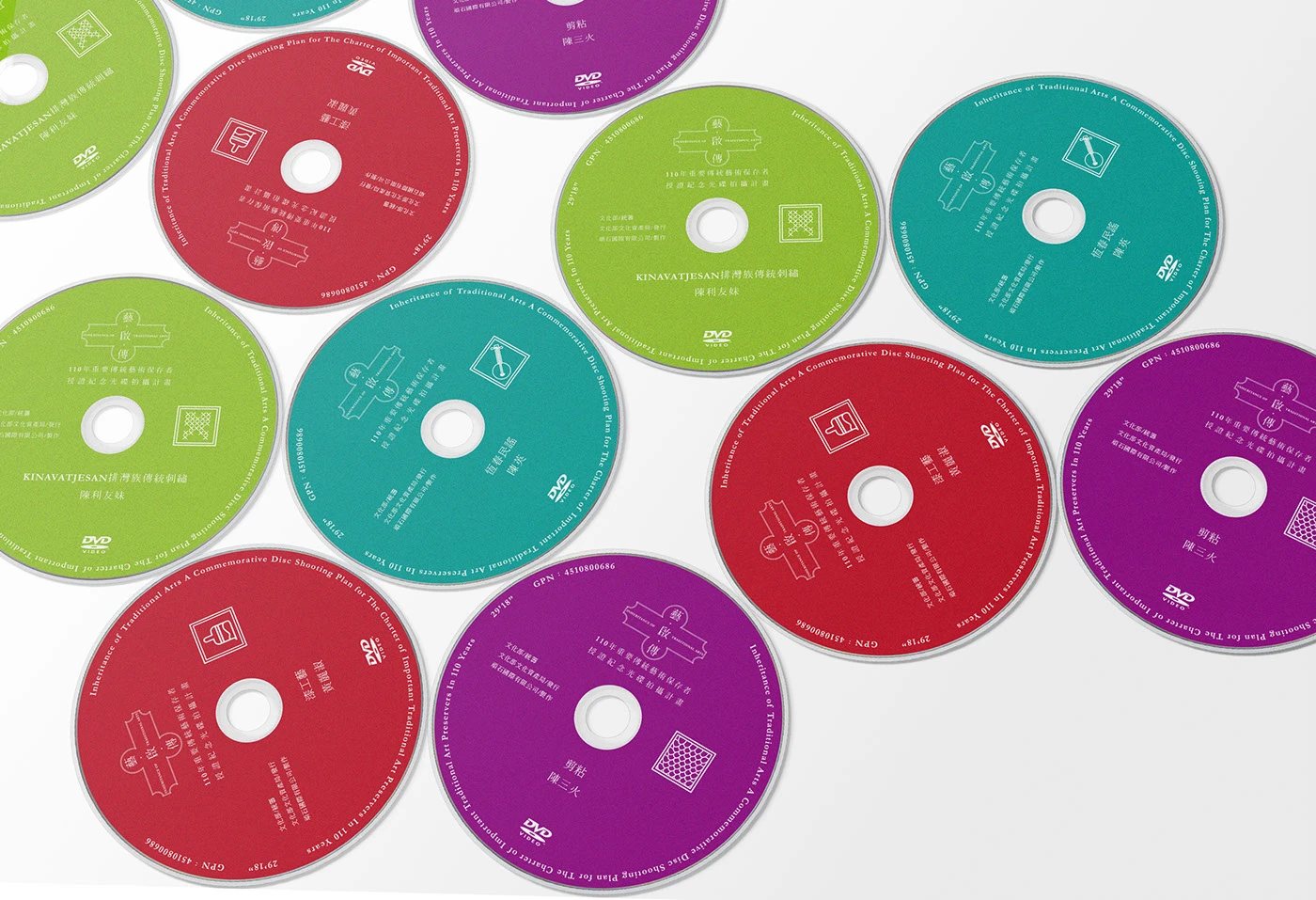
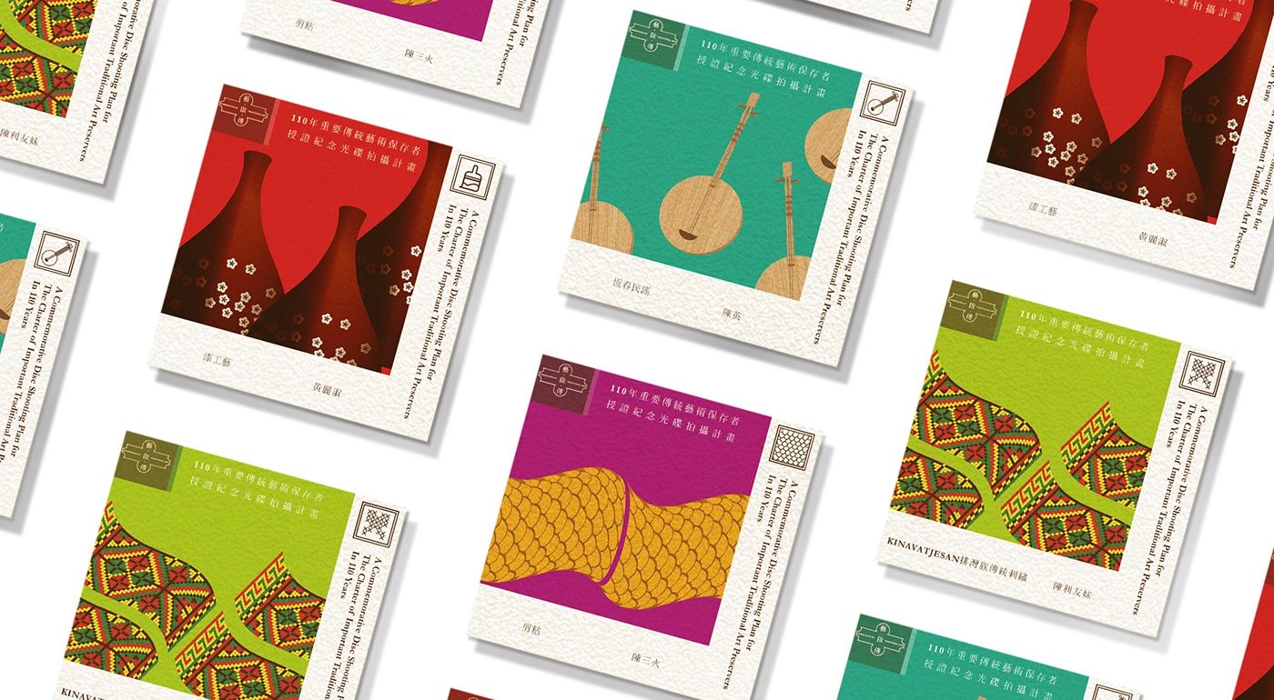
以綠、青、紫、紅等不同顏色區分藝師內容的光碟盤面
Fig.07每位藝師對應一種顏色,取閱多張光碟時可以更快分辨內容。A distinct colour for each artisan makes the discs easier to find and use.
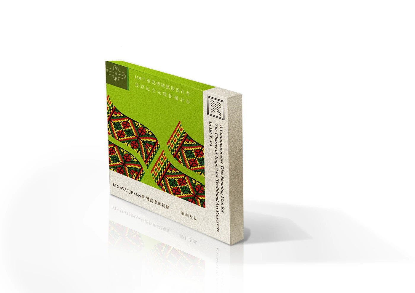
綠色傳統工藝光碟外盒的立體情境示意
Fig.08綠色版本將織紋作為封面主角,在立體包裝上呈現工藝的節奏。In this packaging visualisation, the woven motif gives the green edition its rhythm.
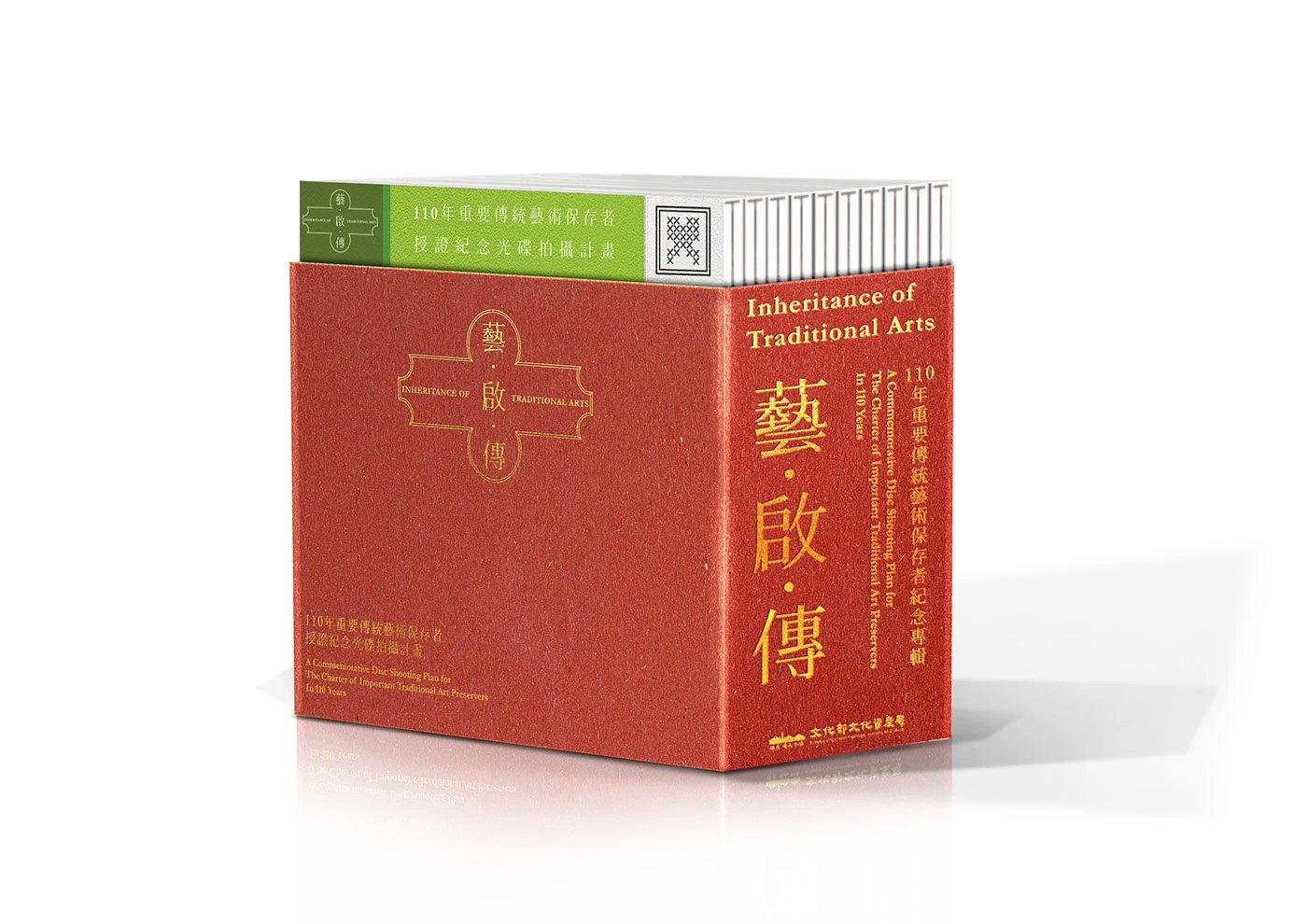
朱紅色藝・啟・傳光碟外盒的立體情境示意
Fig.09朱紅版本以醒目的標準字與留白,讓系列名稱成為第一眼看見的內容。The vermilion edition uses the title and open space to lead the viewer’s eye.
多張不同色彩的傳統工藝紀錄光碟盤面展示
Fig.10四色盤面保留相同的資訊位置,換用色彩與圖像對應不同的工藝主題。The discs share one layout, while colour and imagery distinguish the craft subjects.
綠色藝・啟・傳光碟外盒與折頁攤開展示
Fig.11外盒與折頁攤開後,圖像、文字與光碟位置仍能順著同一條閱讀路徑展開。Opened out, the sleeve and insert keep imagery, text and disc in a clear reading sequence.
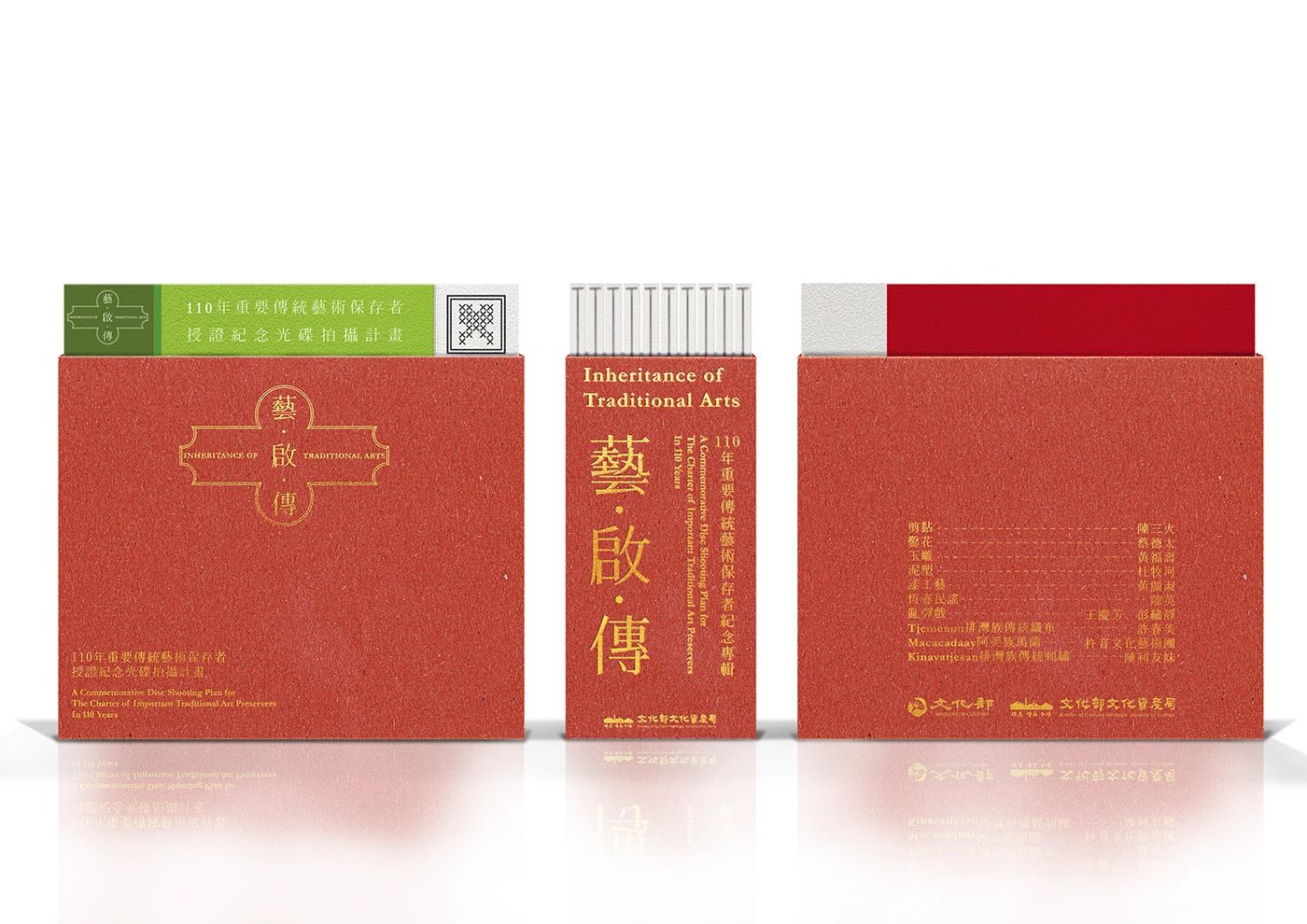
朱紅色藝・啟・傳光碟包裝的正面、側面與背面展示
Fig.12正面、側面與背面都沿用相同的標準字與色彩,讓包裝在不同擺放方式下仍容易辨識。The title and colour remain recognisable from the front, spine and back.
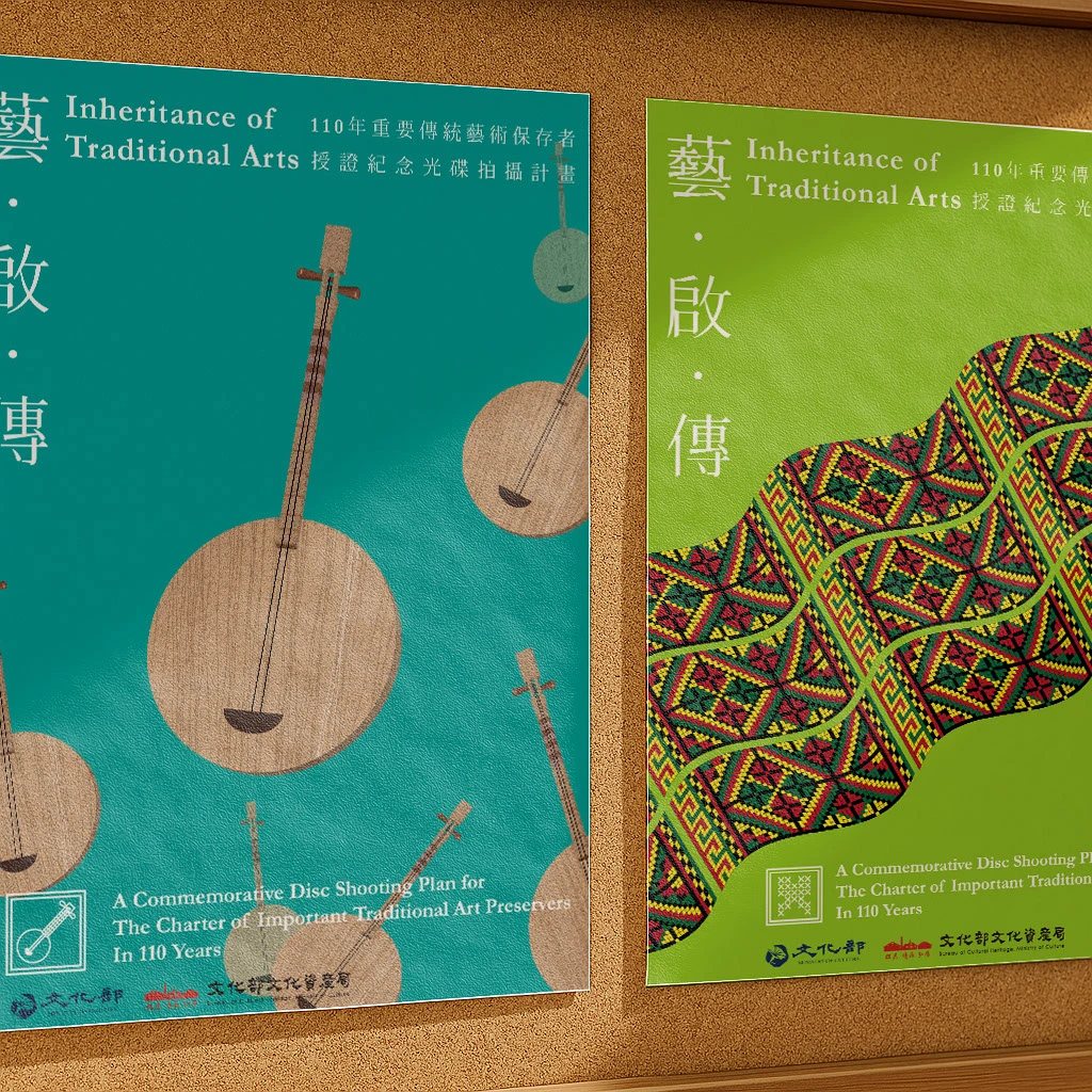
以樂器與織紋為主題的兩張傳統工藝海報情境展示
Fig.13海報把不同工藝的器物與紋樣放大,讓光碟系列的視覺語言走出包裝。The posters enlarge craft objects and patterns, taking the visual language beyond the DVD sleeve.
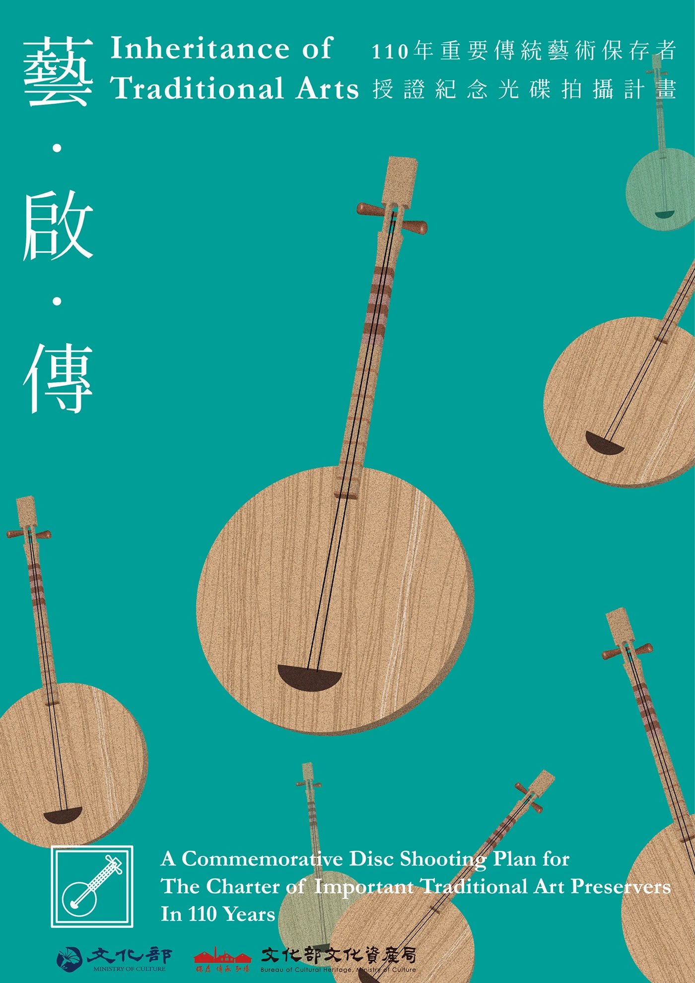
青綠色傳統工藝主題海報,畫面以樂器為主
Fig.14樂器在青綠底色上成為主角,讓觀眾從器物開始認識工藝。The instrument takes centre stage against turquoise, inviting viewers into the craft through its object.
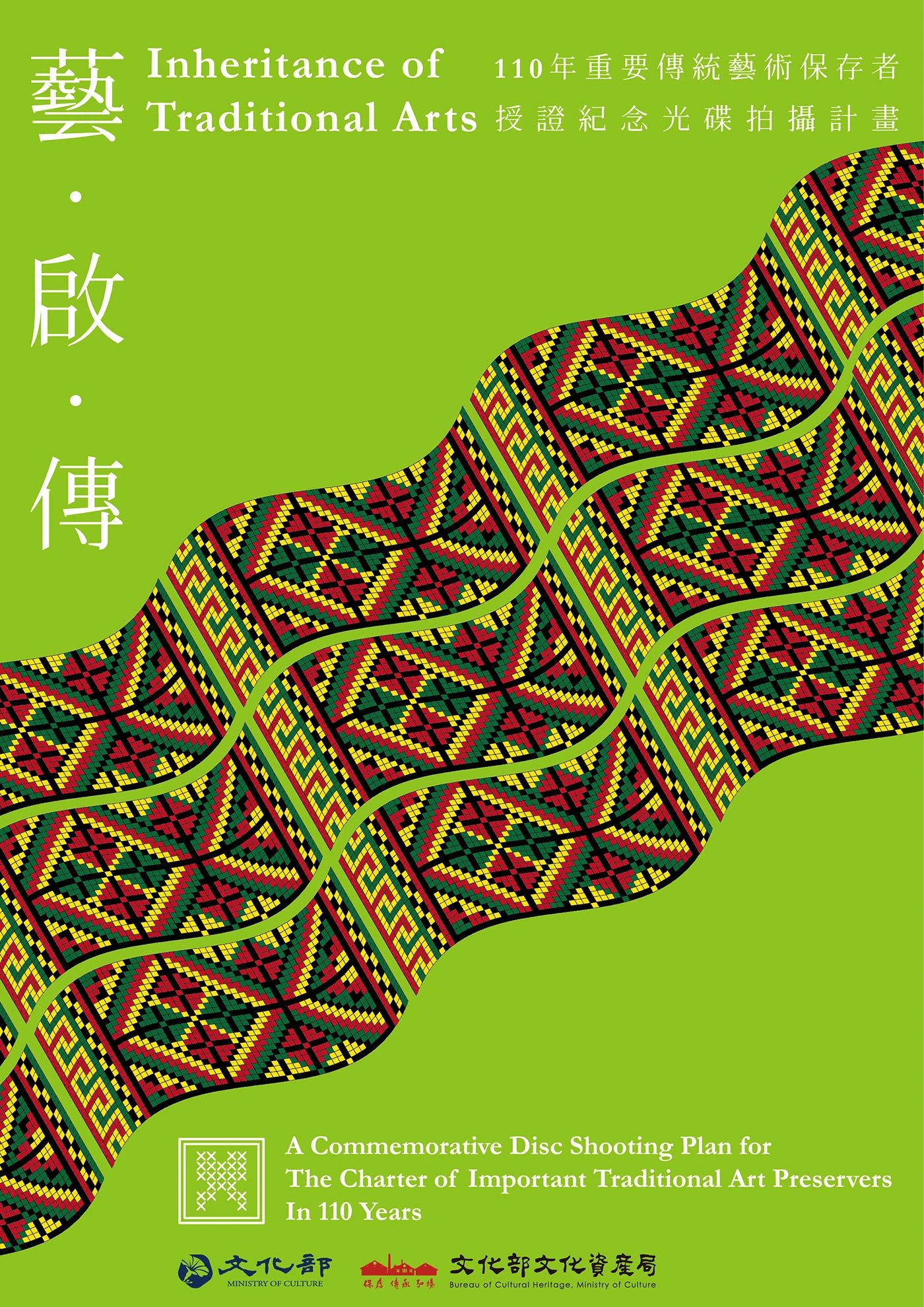
亮綠色傳統工藝主題海報,畫面以彩色織紋為主
Fig.15彩色織紋穿過亮綠色畫面,呈現手作紋樣的節奏與辨識度。A woven motif crosses the bright green poster, giving the craft a recognisable rhythm.
多款傳統工藝系列海報平放展示,呈現不同圖像與色彩
Fig.16不同色彩與工藝圖像並列時,仍能看出它們屬於同一個系列。Different colours and craft images remain recognisable as one series when seen together.