← All Works / 全部作品20 / 21
20 — 2021
我們存在的美麗世界|國史館館藏文物精選展主視覺提案Beautiful World in Which We Exist — Exhibition Visual Proposal
3 views
- Year / 年份
- 2021
- Category / 類別
- Exhibition Visual · Key Visual Proposal
- Role / 角色
- 展覽主視覺設計Exhibition Key Visual Design
- 色彩與版面系統Colour & Layout System
- 應用情境視覺化Application Visualisation
- Scope / 範疇
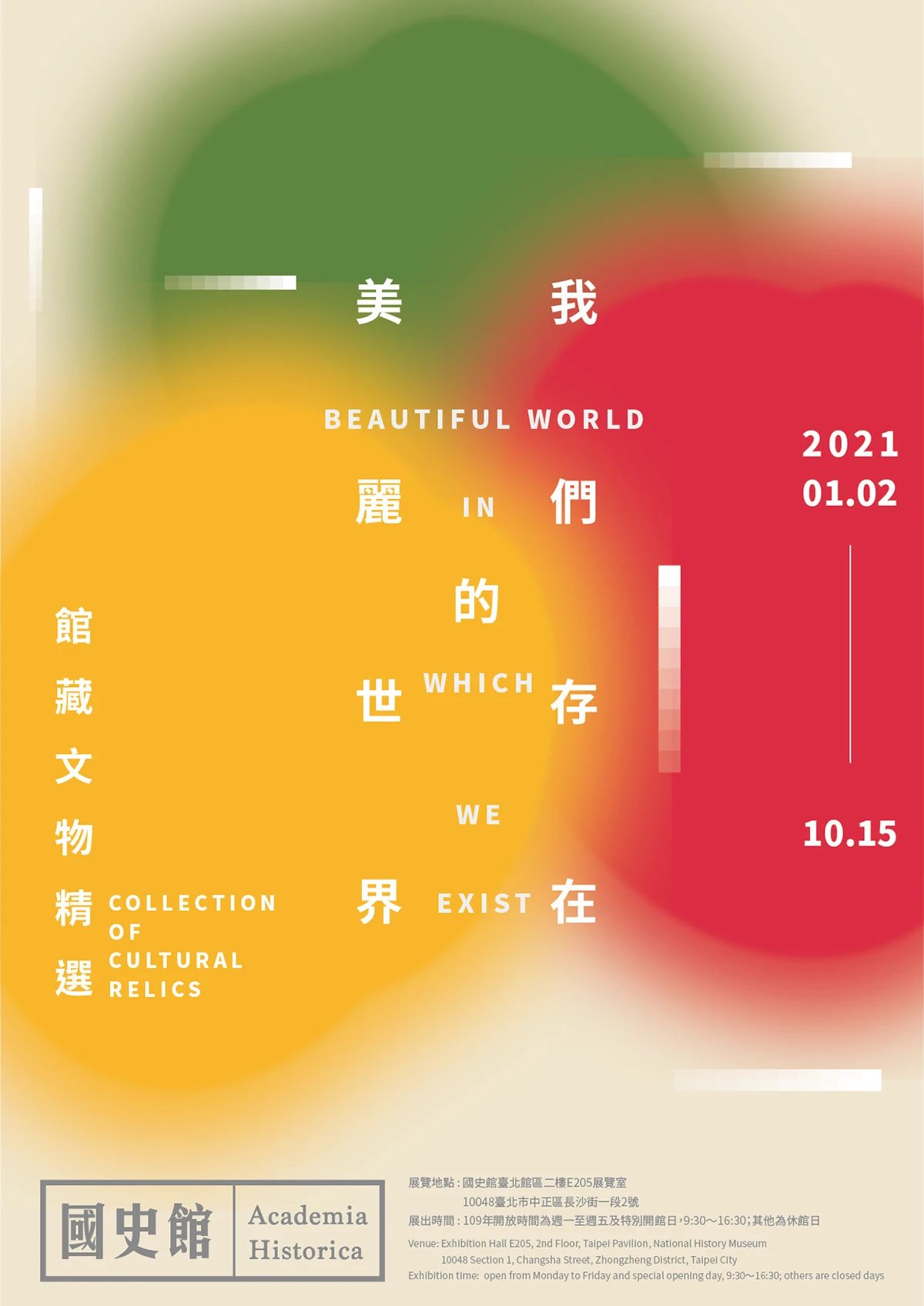
- 主視覺與海報Key Visual & Poster
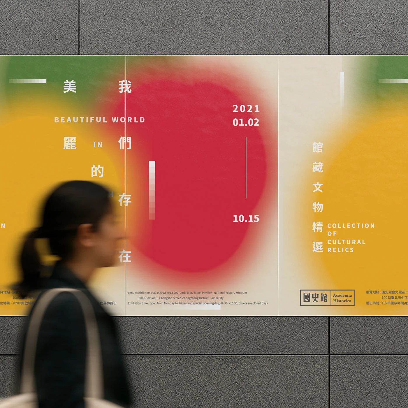
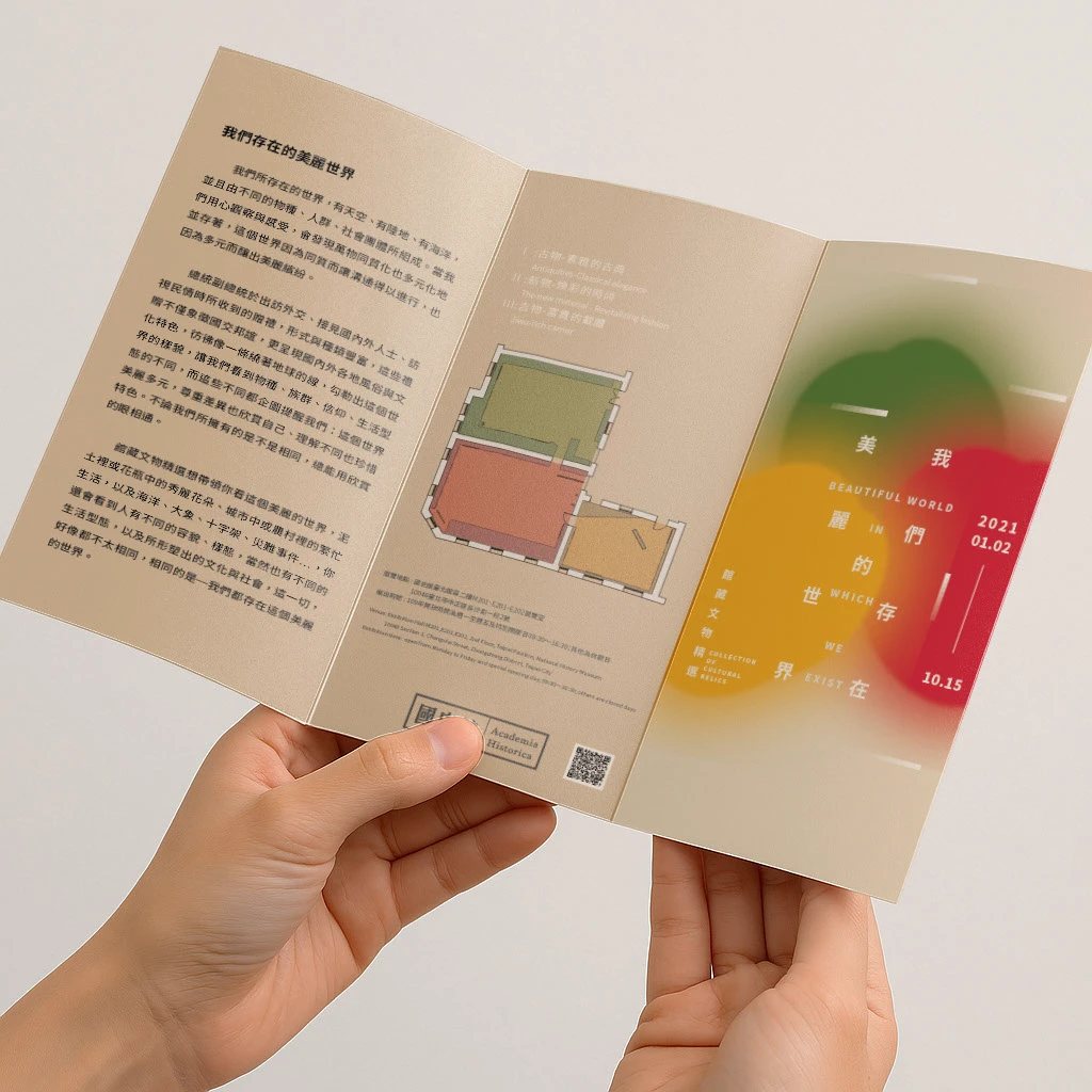
- 折頁與橫式版面Leaflet & Horizontal Layout
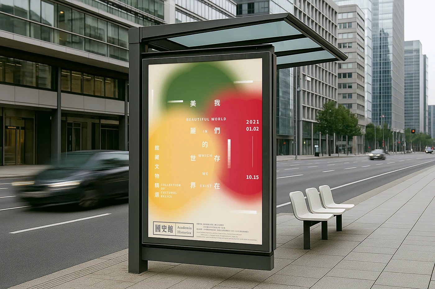
- 街頭展示情境示意Street Display Visualisations
Summary / 專案摘要
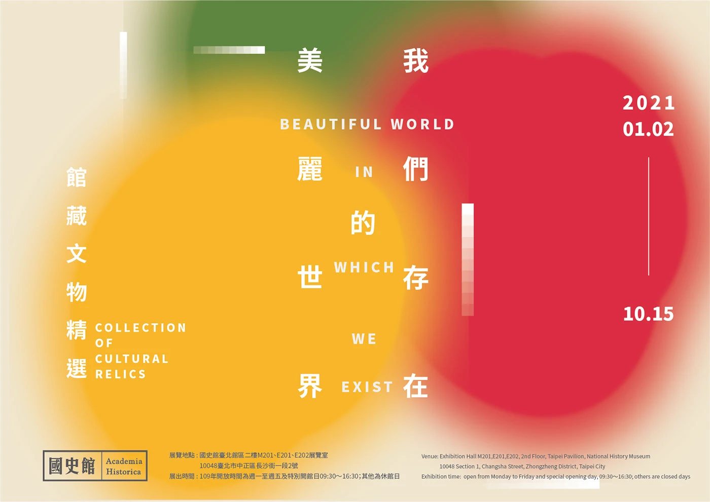
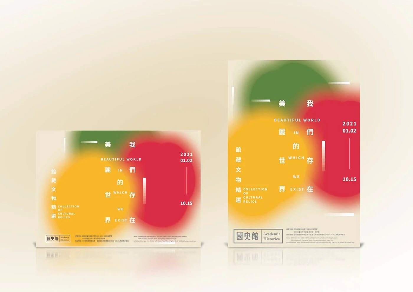
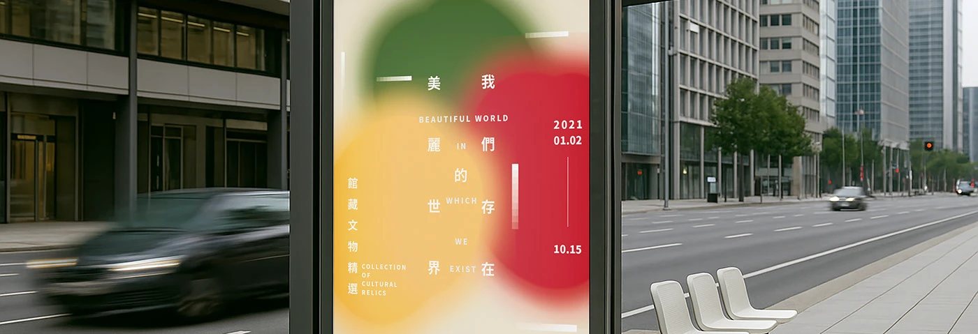
「我們存在的美麗世界」是國史館《館藏文物精選展》的主視覺提案。設計以紅、綠、黃交疊的柔化色塊,回應文物、史料與世代記憶之間的連結;中英文展名穿插在色彩與留白之間,讓觀者先感受到展覽的氣息,再逐步讀取內容。作品包含海報、折頁及街頭展示的應用情境示意。
“Beautiful World in Which We Exist” is a key visual proposal for Academia Historica’s Collection of Cultural Relics exhibition. Soft, overlapping red, green and yellow fields suggest the layers of objects, archives and shared memory. Chinese and English title fragments sit among colour and open space, allowing the exhibition to be felt before it is read. The project includes poster, leaflet and street display visualisations.
- Role / 角色
- 展覽主視覺設計Exhibition Key Visual Design
- 色彩與版面系統Colour & Layout System
- 應用情境視覺化Application Visualisation
- Scope / 範疇
- 主視覺與海報Key Visual & Poster
- 折頁與橫式版面Leaflet & Horizontal Layout
- 街頭展示情境示意Street Display Visualisations