跳至主要內容 / Skip to content
LUNVIA Bureau 橫 Logo

三年五班|品牌提袋設計Class 305 Branded Paper Bag Design

Packaging · Brand Applications / 202410 views
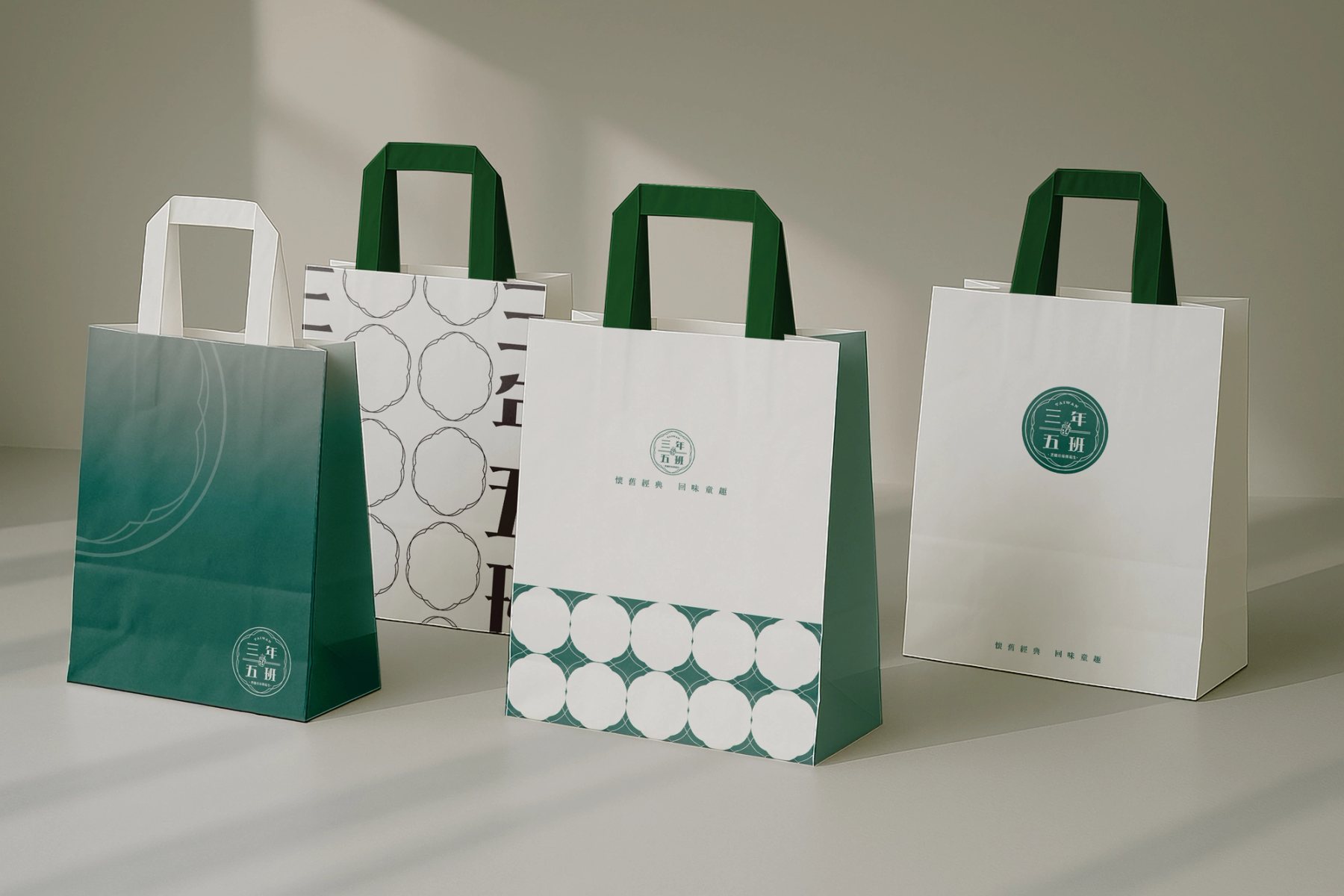
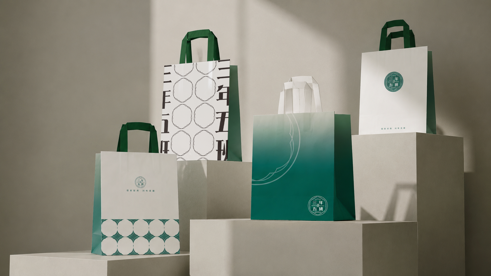
三年五班品牌提袋系列主視覺,展示綠白紙袋與品牌印章應用

專案摘要 Summary

以三年五班的品牌印章與綠白色系為核心,發展一組外帶紙袋視覺系統。設計在標誌、圖案、袋型與色塊之間建立一致的包裝語彙,讓紙袋在街道移動、店內陳列與日常使用中都能維持清楚辨識。 Built around Class 305’s seal mark and green-white palette, this project develops a branded takeaway paper bag system. The design aligns logo, pattern, bag structure, and color blocks into a consistent packaging language that remains recognizable in motion, display, and daily use.

專案圖片 Gallery

三年五班品牌提袋系列主視覺,展示綠白紙袋與品牌印章應用
以綠白色系建立清爽而具記憶點的提袋主視覺,讓品牌印章、袋型與圖案系統形成一致的外帶識別。 A green-and-white paper bag composition builds a fresh takeaway identity, aligning seal mark, bag form, and pattern system.
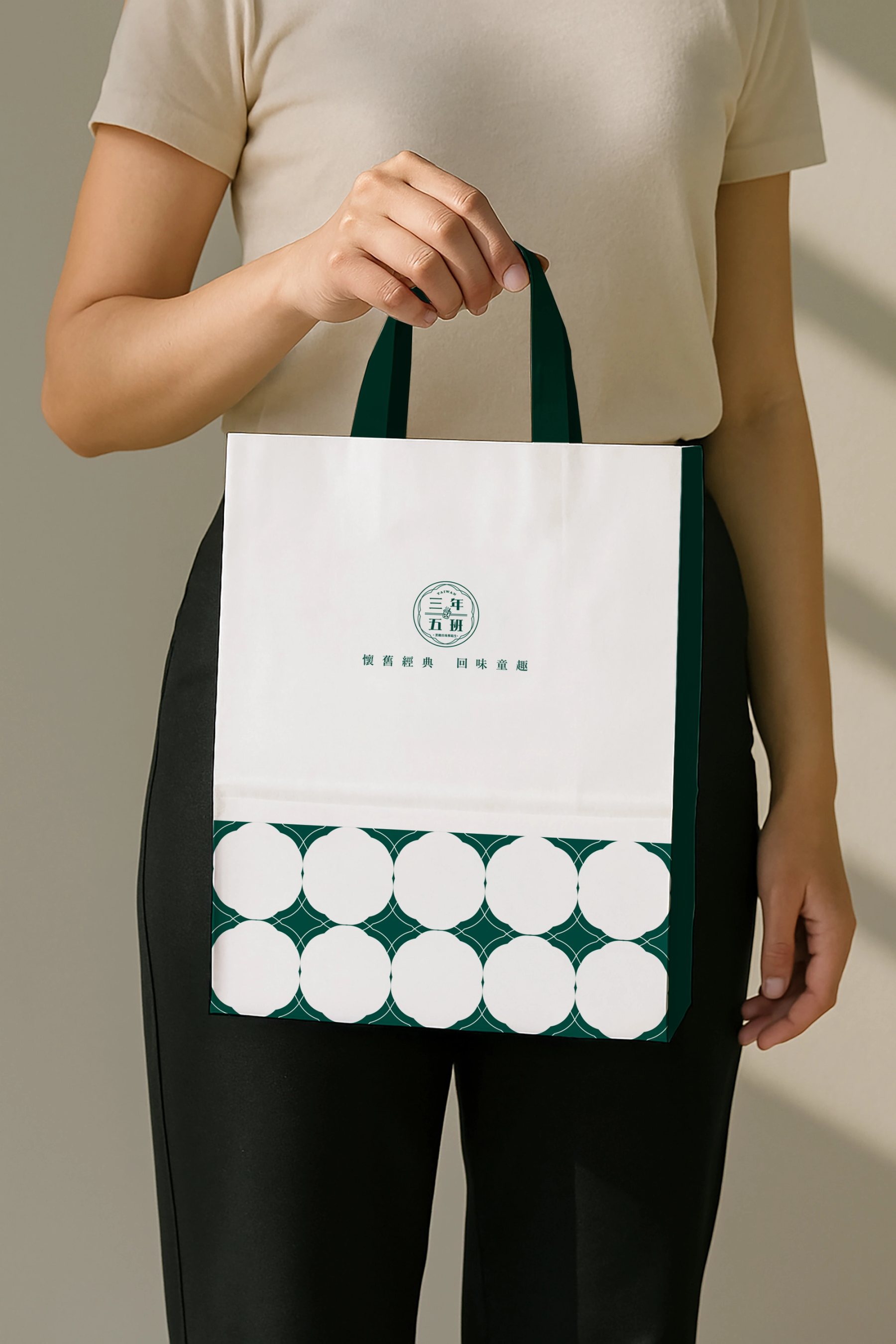
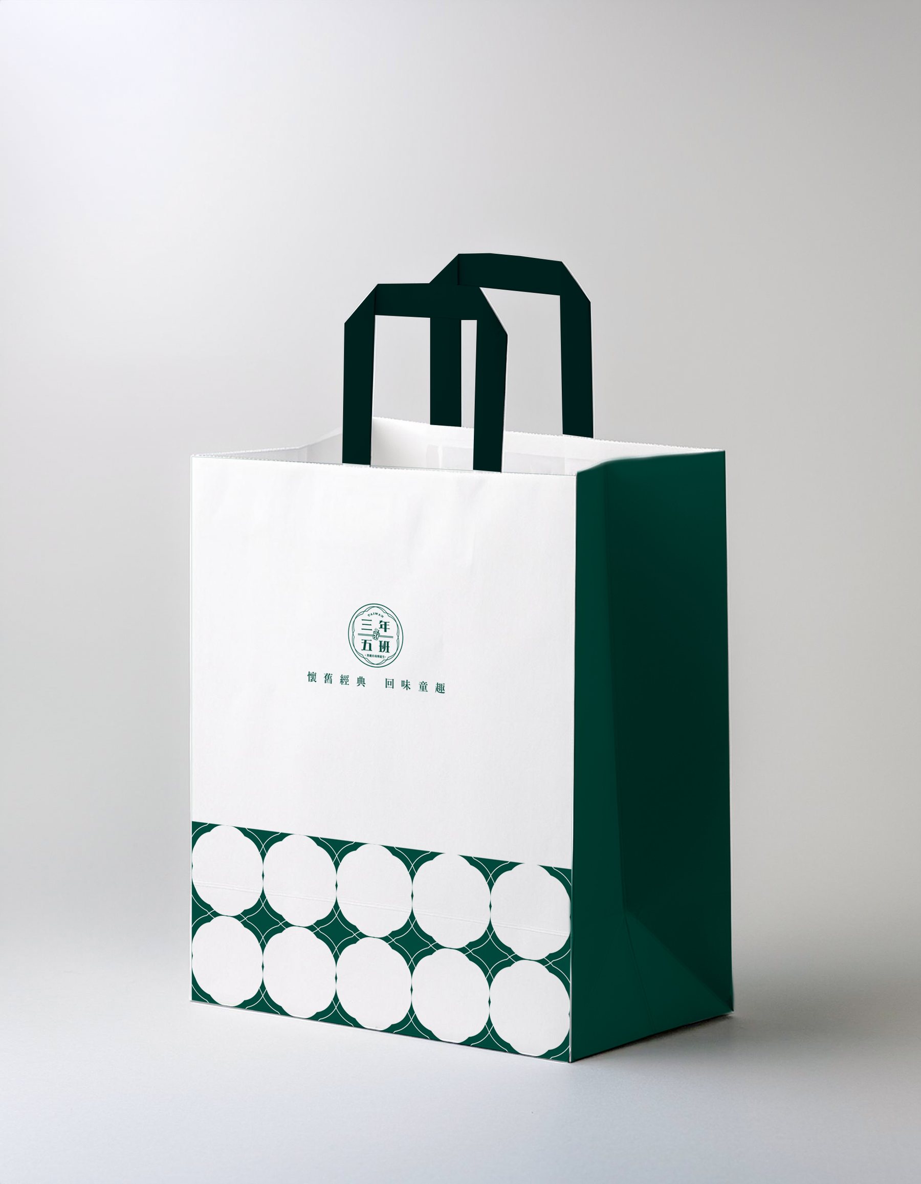
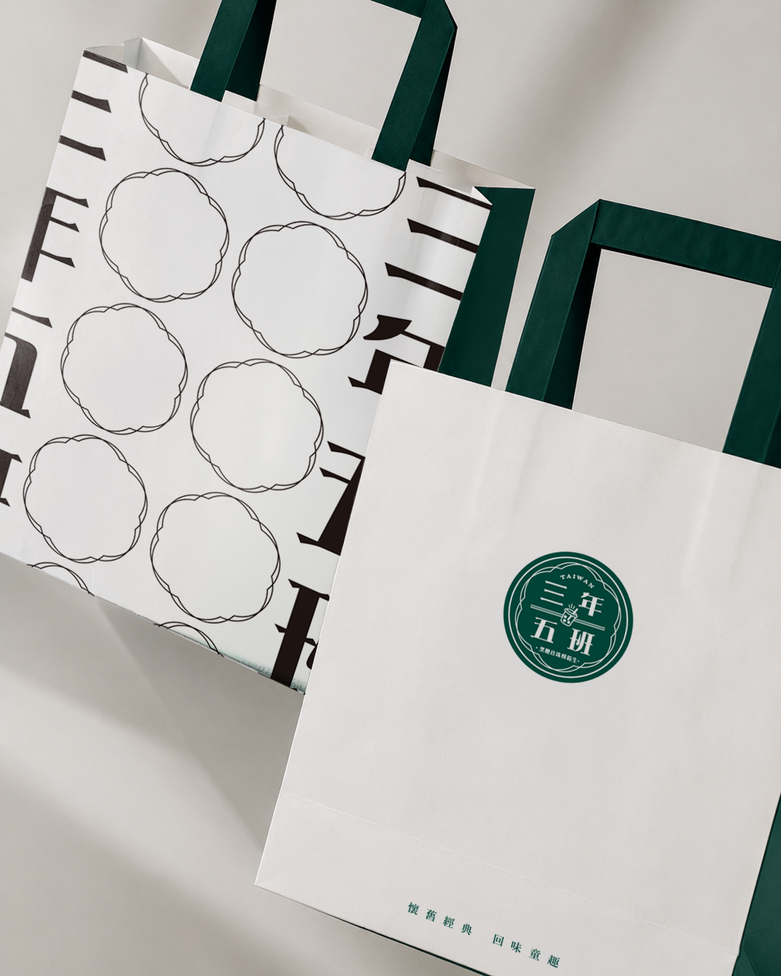
三年五班紙袋直式情境 mockup,呈現手提袋正面與側面結構
直式情境呈現提袋的比例、立面與側邊色塊,強化外帶包裝在實際使用時的辨識度。 A vertical mockup studies the bag proportion, front surface, and side color blocks for stronger recognition in daily use.
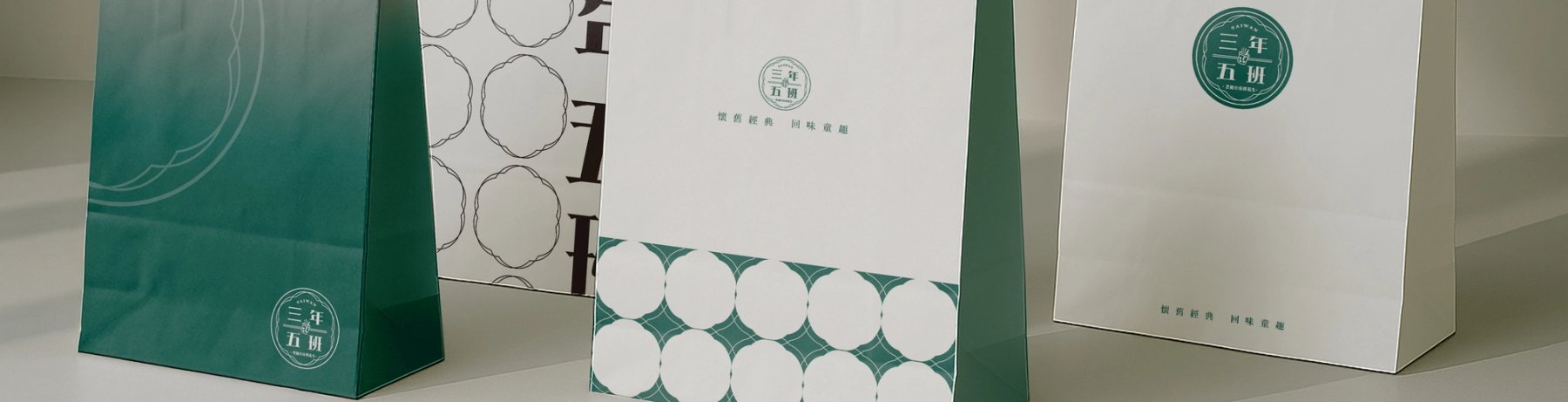
三年五班紙袋橫幅展示,呈現多款提袋排列與視覺節奏
多款提袋並置呈現系列化的包裝節奏,讓單一品牌元素可延伸到不同尺寸與觀看角度。 A panoramic arrangement shows how one identity system can extend across different bag sizes and viewing angles.
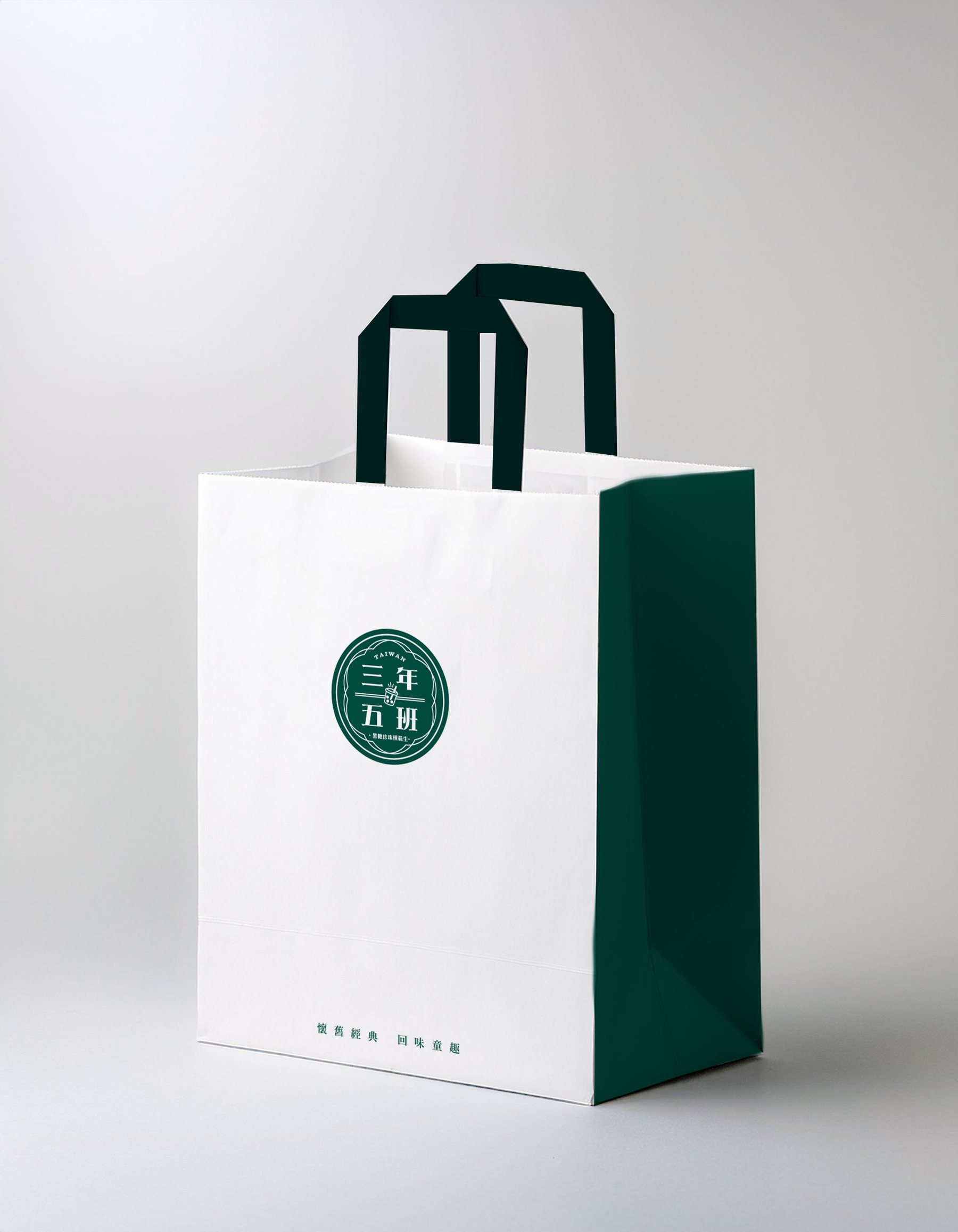
三年五班提袋版面設計 01,綠色底與圓形標誌應用
以深綠底色與圓形標誌建立主要識別版本,提供較強的品牌色塊與遠距辨識。 A dark-green version anchors the primary identity with a bold color field and round seal mark for distance recognition.
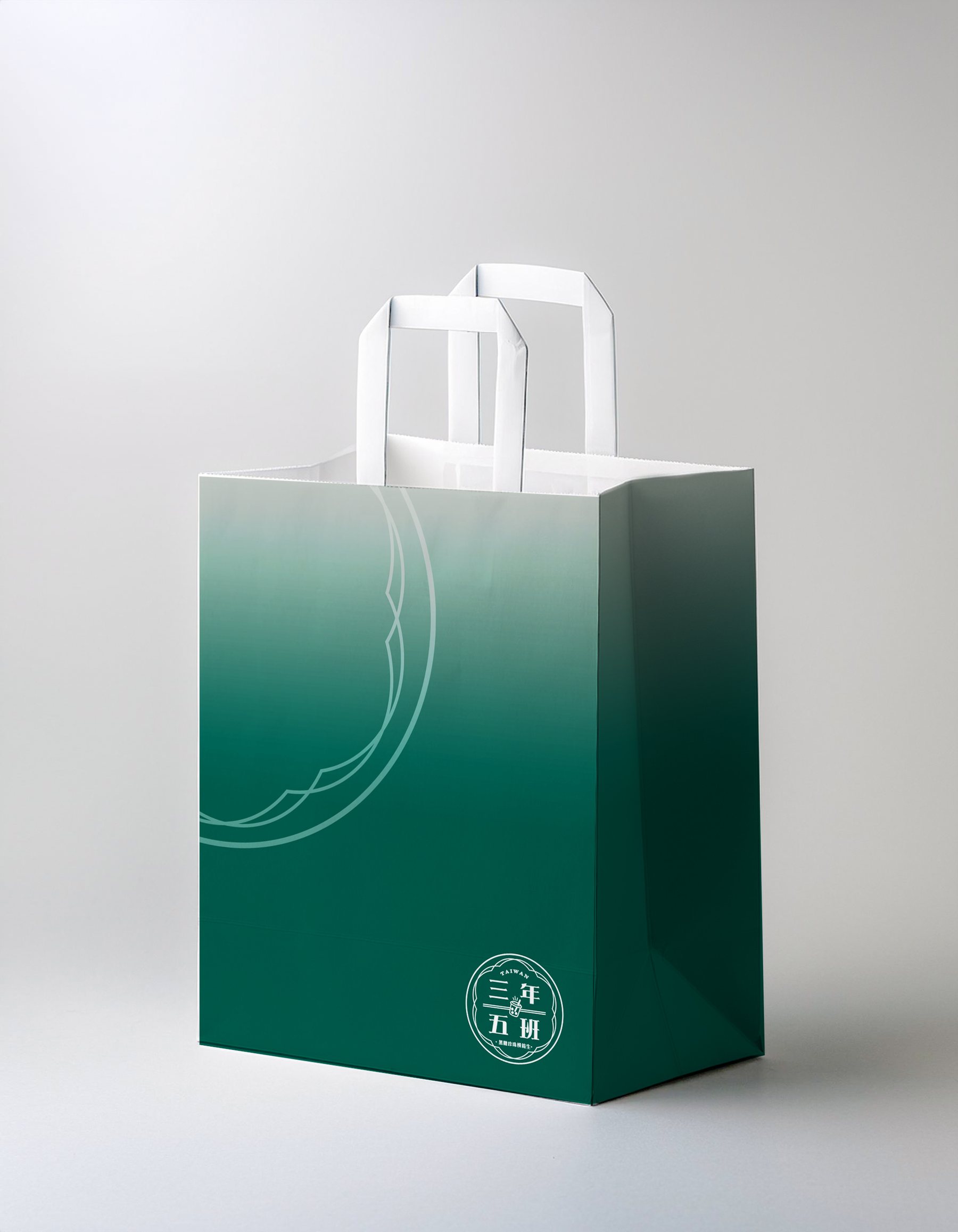
三年五班提袋版面設計 02,綠色漸層袋身與圓形章標應用
綠色漸層袋身以大面積品牌色建立醒目識別,搭配圓形章標與線條圖案,適合需要較強視覺存在感的外帶包裝。 The green gradient bag uses a large brand color field for strong recognition, paired with the round seal mark and line motif for a more visible takeaway package.
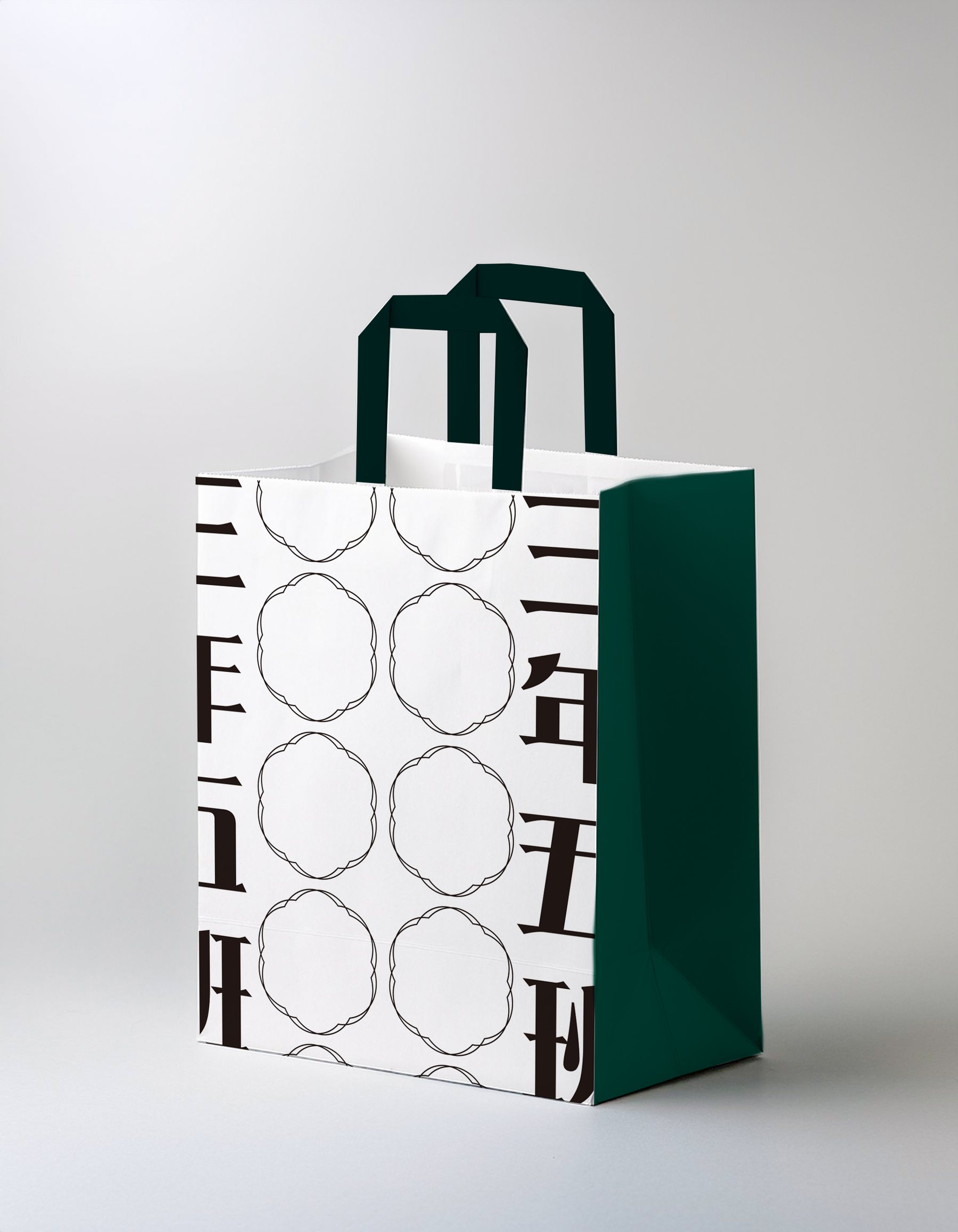
三年五班提袋版面設計 03,圖案化圓形元素與側邊文字
圖案化圓形元素延伸品牌的食物聯想,搭配側邊文字形成可重複使用的包裝語彙。 Patterned circular motifs extend food associations, while side typography creates a reusable packaging language.
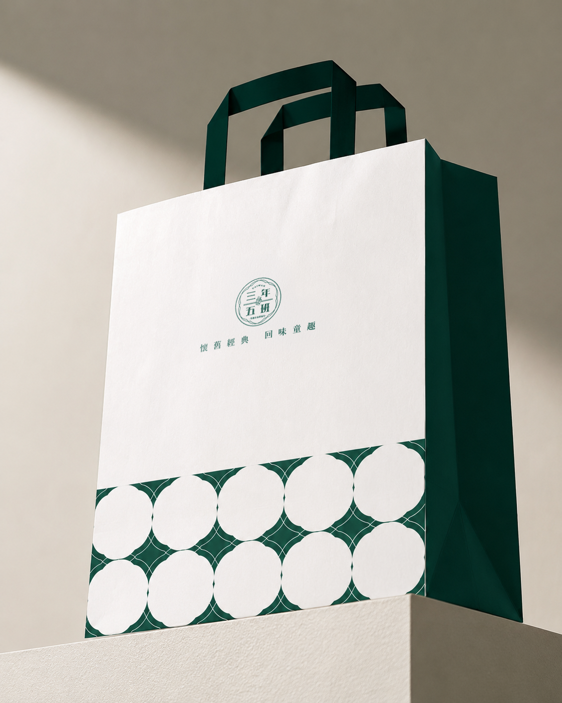
三年五班提袋版面設計 04,綠白圖案與品牌章標排列
以章標、圖案與色塊建立多層次排列,讓紙袋在靜態展示與手持移動中都保持清楚識別。 Seal mark, pattern, and color blocks form a layered layout that remains legible both on display and in motion.
三年五班品牌提袋生成情境圖 01,呈現紙袋在光影空間中的應用
延伸情境圖測試提袋在自然光影中的材質感與品牌色表現,作為包裝氛圍提案參考。 An extended visual test explores material texture and brand color under natural light as a packaging mood reference.
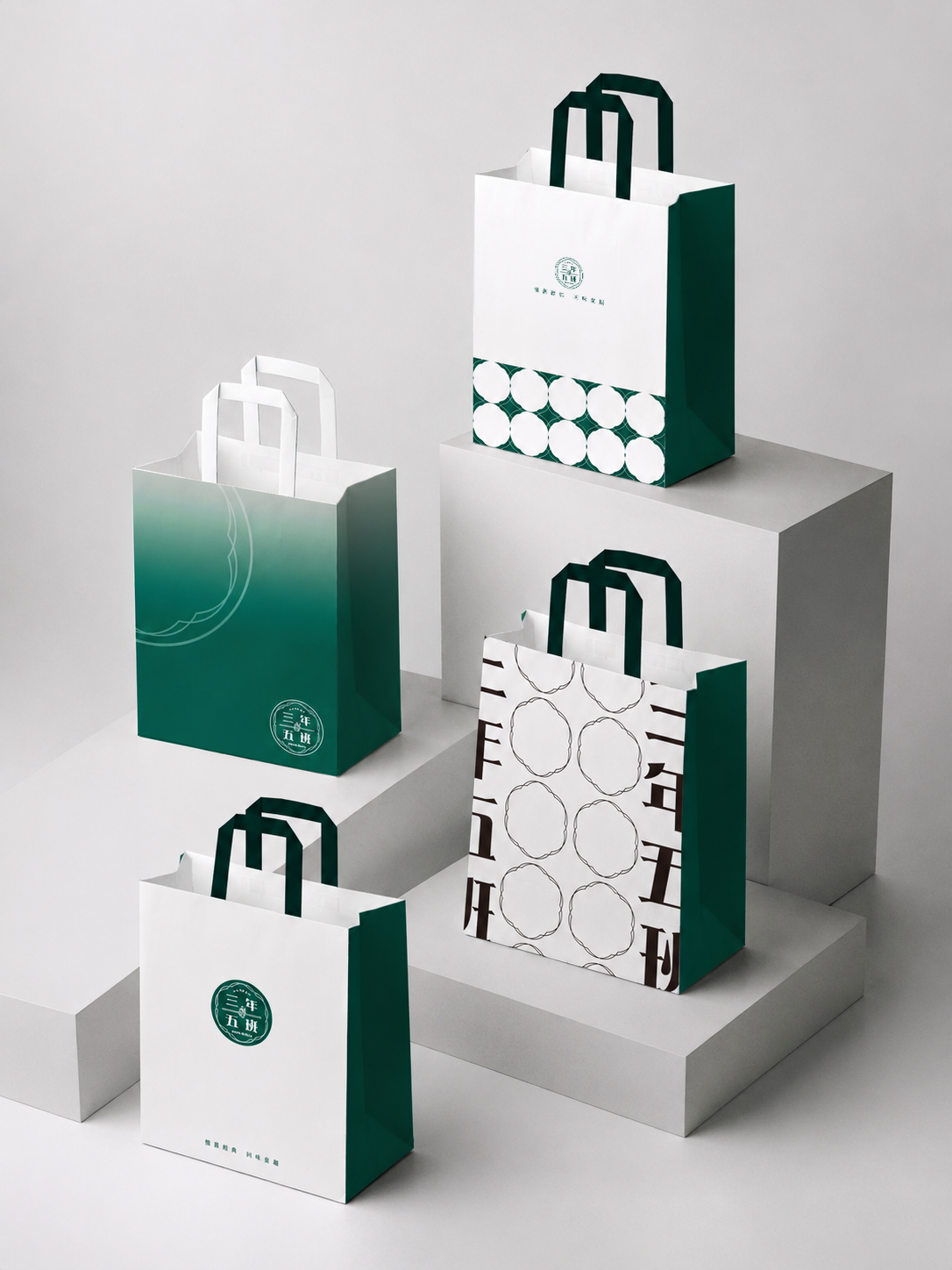
三年五班品牌提袋生成情境圖 02,呈現紙袋系列與桌面展示
桌面展示模擬多款包裝共同出現時的整體秩序,確認系列在陳列畫面中的一致性。 A tabletop composition tests the order and consistency of the full bag series in display scenarios.
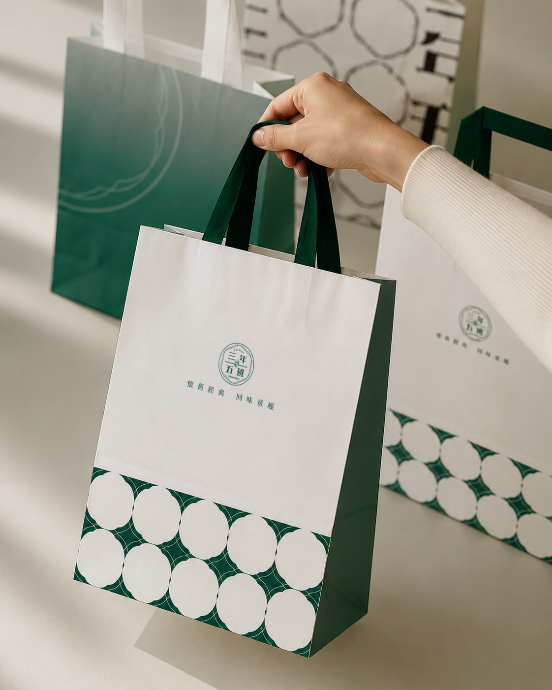
三年五班品牌提袋生成情境圖 03,呈現外帶紙袋與綠色品牌元素
以外帶情境檢視標誌、提把與袋身色彩的協調,讓品牌在日常移動中仍被看見。 A takeaway scene checks the relationship between logo, handle, and bag color so the brand remains visible in motion.
三年五班品牌提袋生成情境圖 04,呈現紙袋細節與環境氛圍
細節情境強調紙袋邊線、折角與品牌印記,補足平面版面之外的使用想像。 A detail scene highlights edges, folds, and brand marks, extending the design beyond flat artwork.
三年五班品牌提袋生成情境圖 05,呈現系列包裝的生活化應用
生活化情境測試包裝在不同背景中的溫度與辨識,讓提袋不只是容器,也成為品牌接觸點。 A lifestyle scene tests warmth and recognition across backgrounds, turning the bag into a recurring brand touchpoint.

角色 Role

  • 包裝視覺設計Packaging Visual Design
  • 品牌應用延伸Brand Application Extension
  • 圖案系統規劃Pattern System Planning
  • 情境模擬與 MockupScenario Mockup

設計範疇 Scope

  • 外帶紙袋設計Takeaway Paper Bag Design
  • 品牌章標應用Seal Mark Application
  • 包裝圖案系統Packaging Pattern System
  • 色彩與版面規範Color and Layout System
  • 陳列情境視覺Display Scenario Visuals

關鍵指標 KPIs

  • 品牌辨識提升Brand Recognition
  • 外帶場景可視性Takeaway Visibility
  • 包裝系列一致性Packaging System Consistency
  • 低成本延展性Cost-friendly Adaptability