跳至主要內容 / Skip to content
12 — 2025

JOIE 樂行|名片識別系統與三款提案JOIE Taxi — Business Card Identity System

70 views
Year / 年份
2025
Category / 類別
Brand Identity · Business Card System
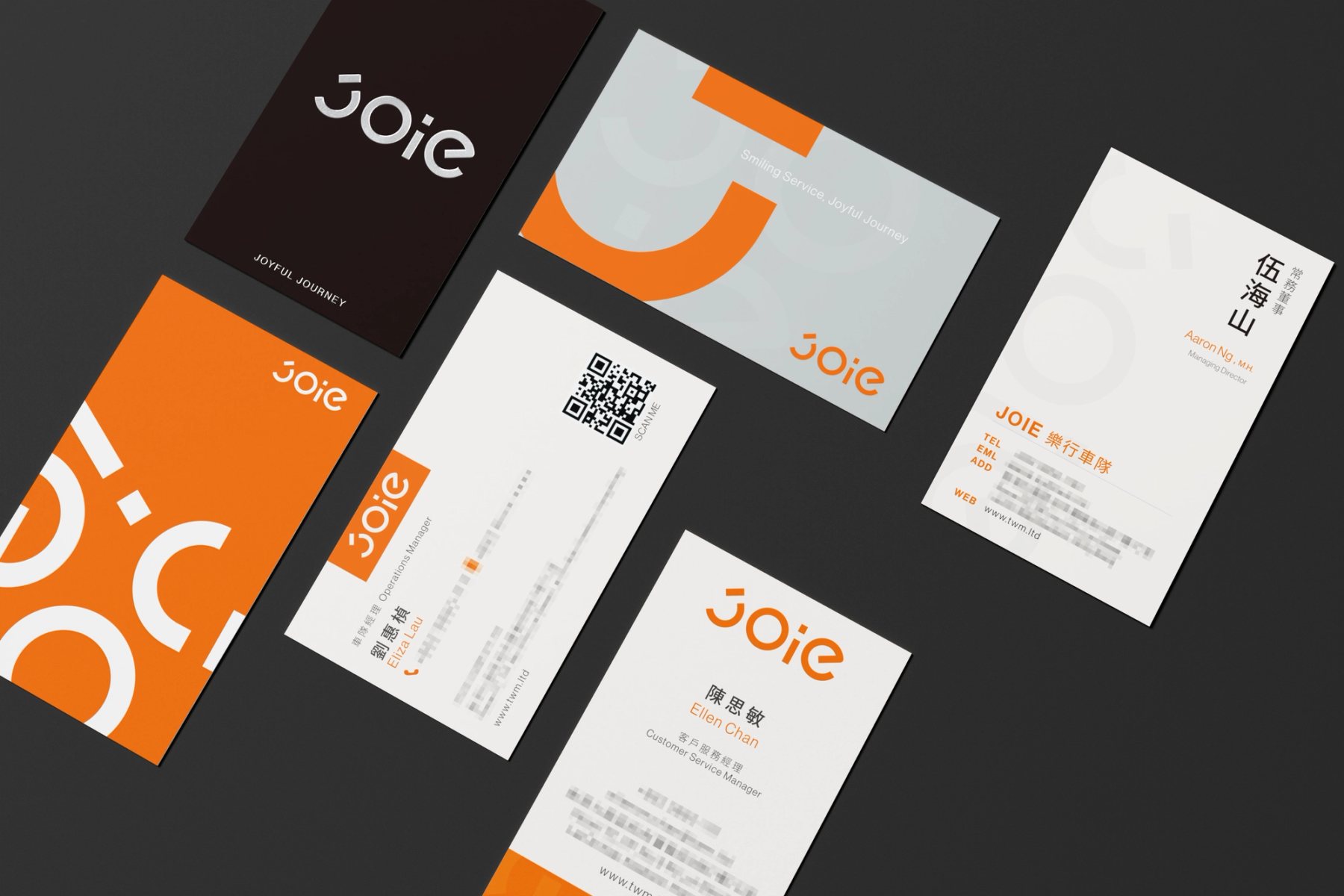
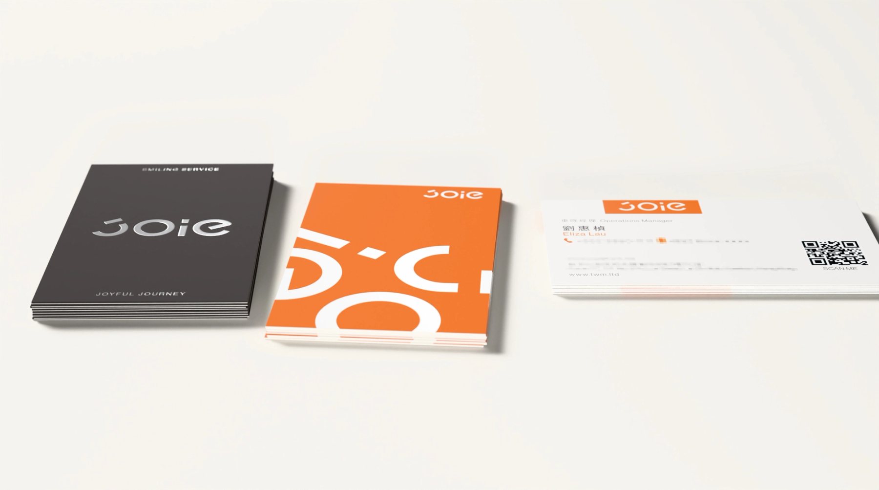
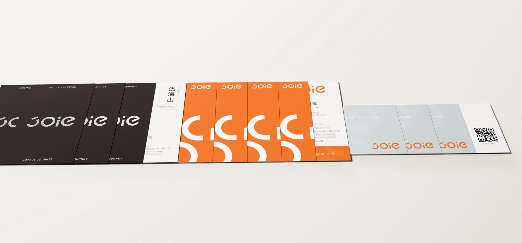
JOIE 樂行三款名片提案同框:黑色商務款、橘色品牌活力款與灰色服務導向款的 3D 示意
Summary / 專案摘要

同一個 JOIE 字標,在不同工作角色手中需要呈現不同的分量。提案以商務簡約、品牌活力與服務導向三款名片,分別處理尊榮服務、溝通清晰與微笑出行。完整字標、道路般的圖形節奏與上揚的弧線,來自同一套識別語言。

三款呈現的是提案階段的探索。正式製作時,客戶從中選定一款正面與一款背面,整合為交付稿。案例保留探索、角色分工與最後選擇,也以 3D 視覺化示意紙張、燙銀與局部上光的可能表現。這些畫面並非實物攝影;材質與加工數值不代表量產規格。

A single JOIE mark needs to carry different weight in different hands. Three proposed card directions address executive presence, clear communication and everyday service. The complete mark, road-like rhythm and upward curve remain part of one visual language.

The three directions document the proposal stage. For production, the client selected one front and one reverse to combine into the delivered artwork. The case records that decision alongside 3D studies of paper, foil and spot gloss. These studies are visualisations, not product photographs or confirmed production specifications.

Role / 角色
  • 名片識別與提案規劃 Business Card Identity & Concepts
  • 版式與資訊層級 Layout & Information Hierarchy
  • 印刷工藝視覺化 Print Finish Visualisation
Scope / 範疇
  • 三款名片提案 Three Card Directions
  • 正反面組合與交付 Front–Reverse Selection & Artwork
  • 作品集 3D 渲染 Portfolio 3D Rendering
Goals / 設計目標
  • 01依角色區分識別 Role-Specific Recognition
  • 02保持同一品牌語言 One Shared Visual Language
  • 03讓正反面選擇有依據 Documented Front–Reverse Selection
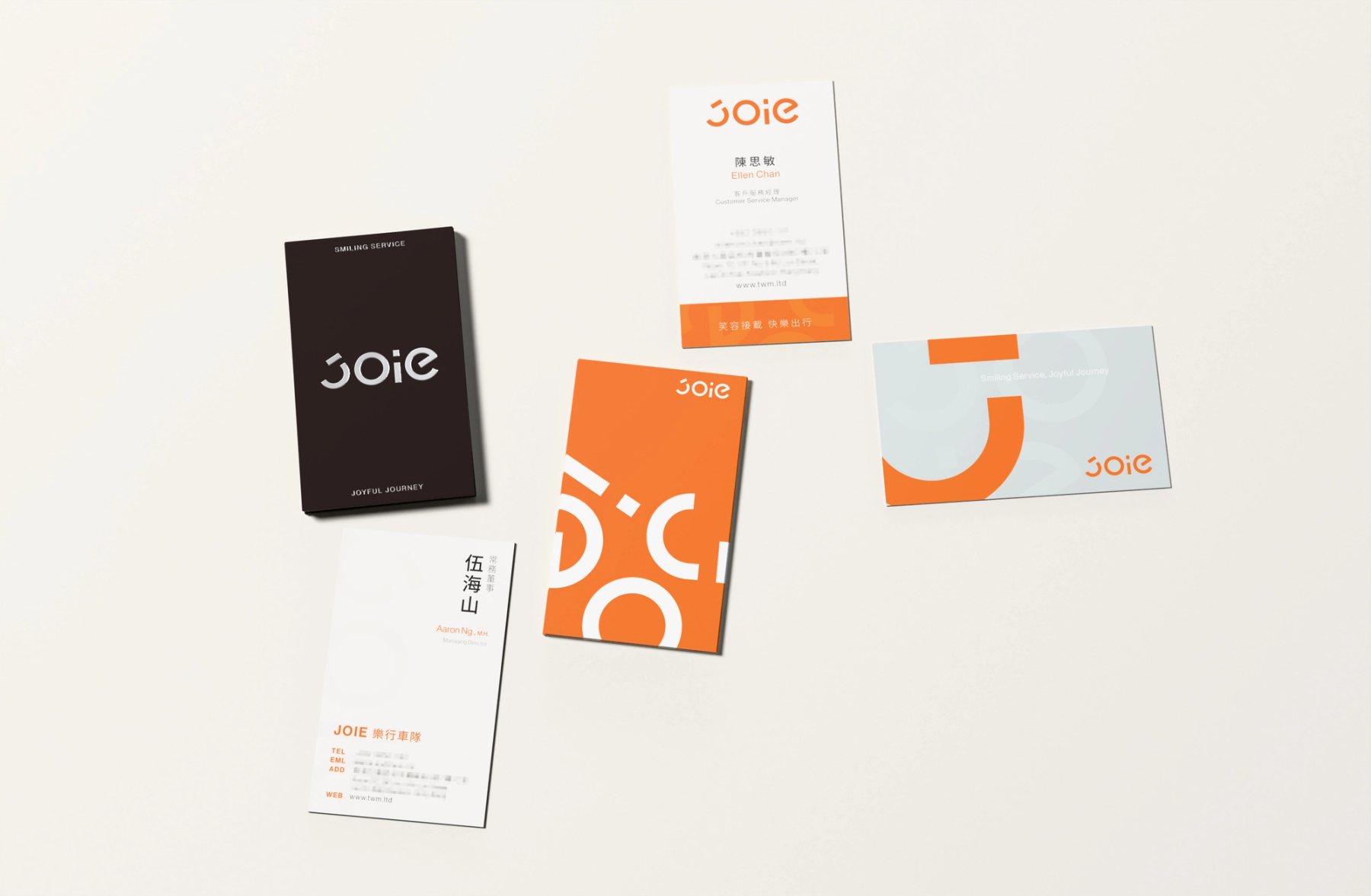
JOIE 三款名片提案並列,呈現黑、橘、灰三種角色方向
Fig.0101 探索|三款提案從同一個 JOIE 字標出發,調整色彩、版式與資訊密度。01 Exploration | Three directions begin with one JOIE mark and vary colour, layout and information density.
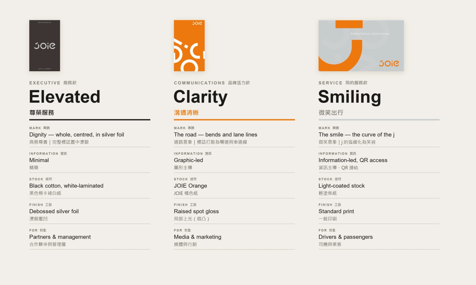
JOIE 三角色名片識別對照圖,列出尊榮服務、溝通清晰與微笑出行
Fig.0202 三個角色,同一識別|尊榮服務、溝通清晰、微笑出行;圖形與工藝依使用情境分配。02 Three roles, one identity | Executive, communications and service each use the mark and finish differently.
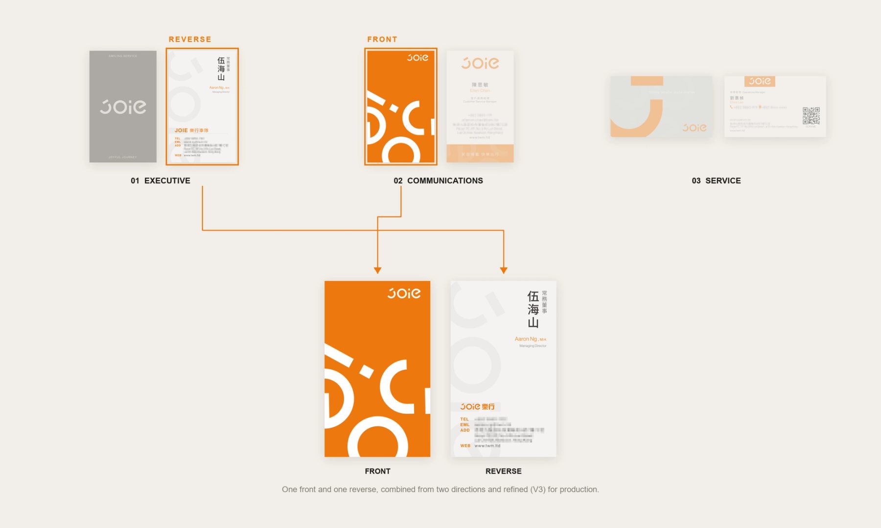
JOIE 名片提案正反面選擇圖,展示客戶由不同提案整合定稿
Fig.0303 最後選擇|客戶從三款提案中選定一款正面與一款背面,組合成正式交付稿。03 Final selection | The client chose one front and one reverse from the proposals for the delivered artwork.
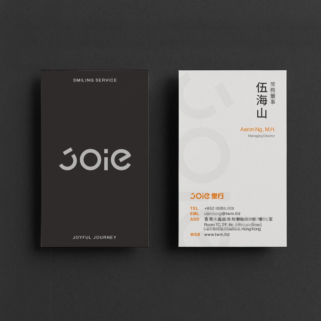
JOIE 商務簡約款名片正反面原稿展示
Fig.0404 商務款|深色識別面與白色資訊面形成清楚的正反對照。04 Executive | A dark identity side is paired with a white information side.
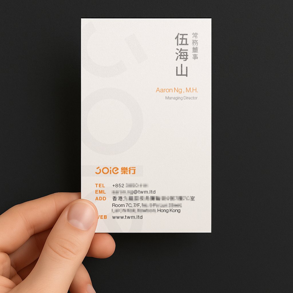
手持 JOIE 商務簡約款白色資訊面名片
Fig.05手持尺度呈現白色資訊面的文字層級。In-hand scale shows the hierarchy on the white information side.
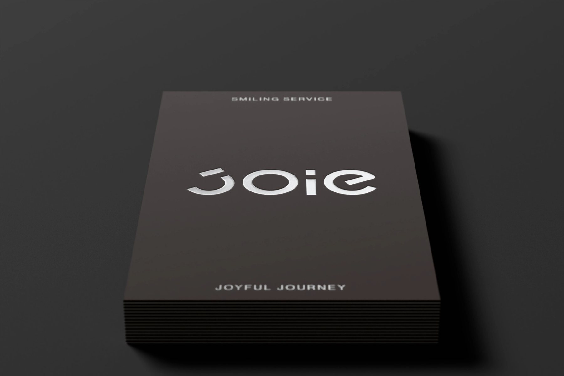
JOIE 黑色商務款名片 3D 渲染,完整字標位於中軸
Fig.06完整字標置於中軸,保留深色卡面的留白與安定感。The complete mark sits on the central axis, leaving the dark card face quiet and spacious.
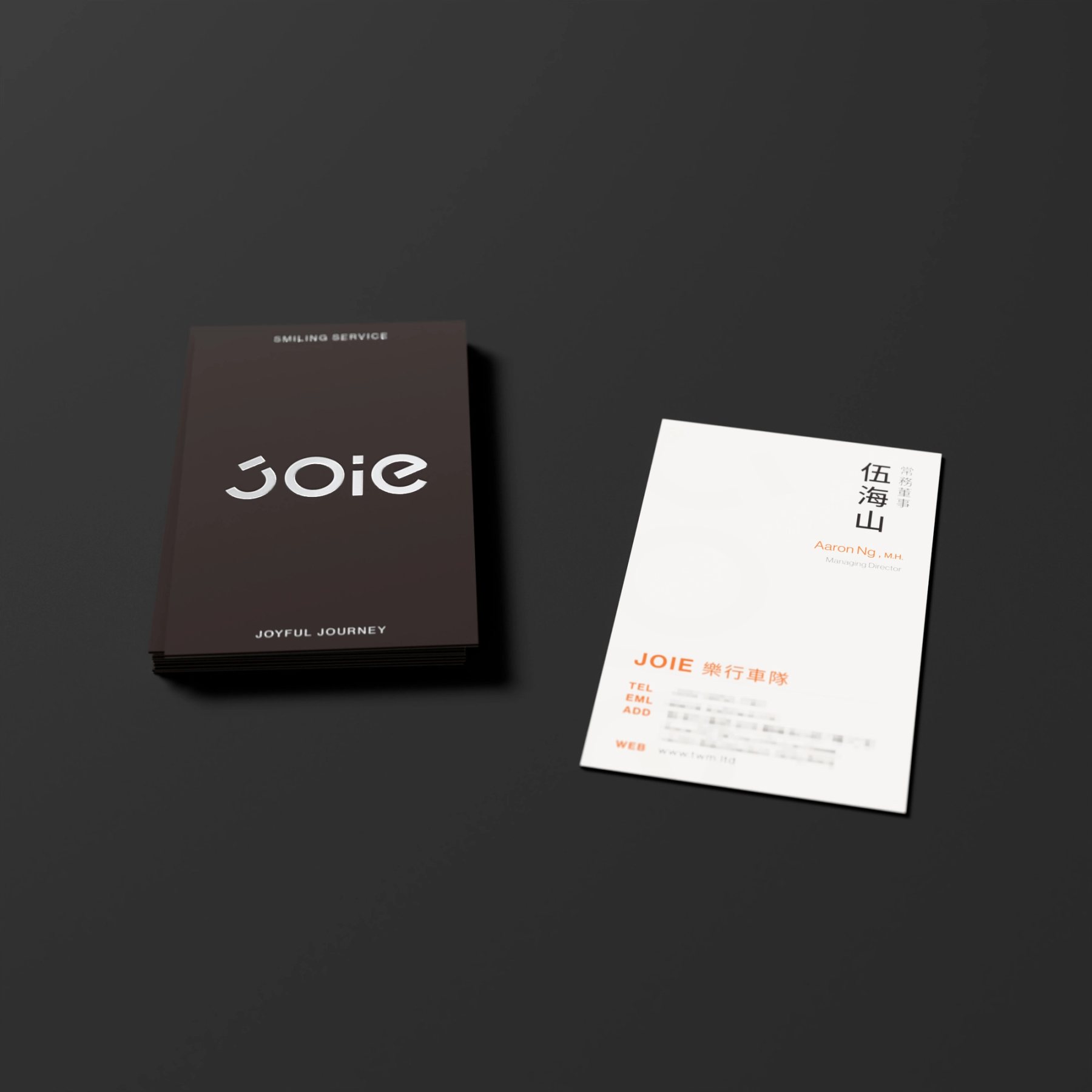
JOIE 商務款黑色識別面與白色資訊面的 3D 組合示意
Fig.07黑色識別面與白色資訊面並置,檢視兩面在遞交時的閱讀順序。Black identity and white information sides are shown together to test the reading sequence.
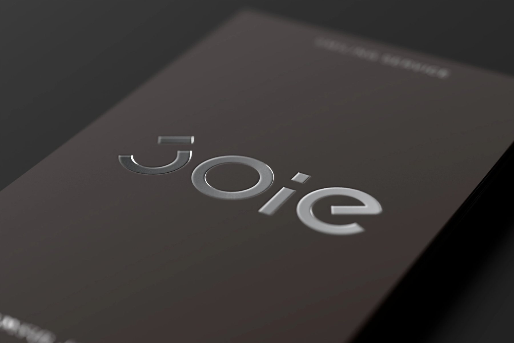
JOIE 商務款字標燙銀與壓凹效果的 3D 工藝示意
Fig.08燙銀與壓凹的反光以 3D 模擬,說明完整字標在深色表面的材質層次。A 3D study of silver foil and debossing shows how the complete mark might catch light.
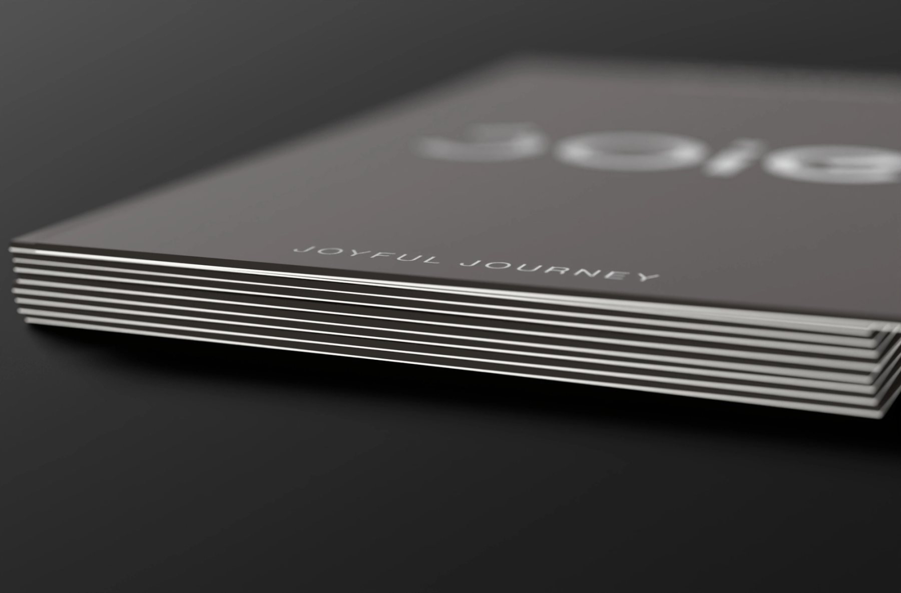
JOIE 商務款黑白雙層切邊與紙張堆疊 3D 示意
Fig.09黑色卡面與白色資訊面的雙層切邊,是紙張結構的視覺化假設。The black-and-white duplex edge visualises a possible paper construction.
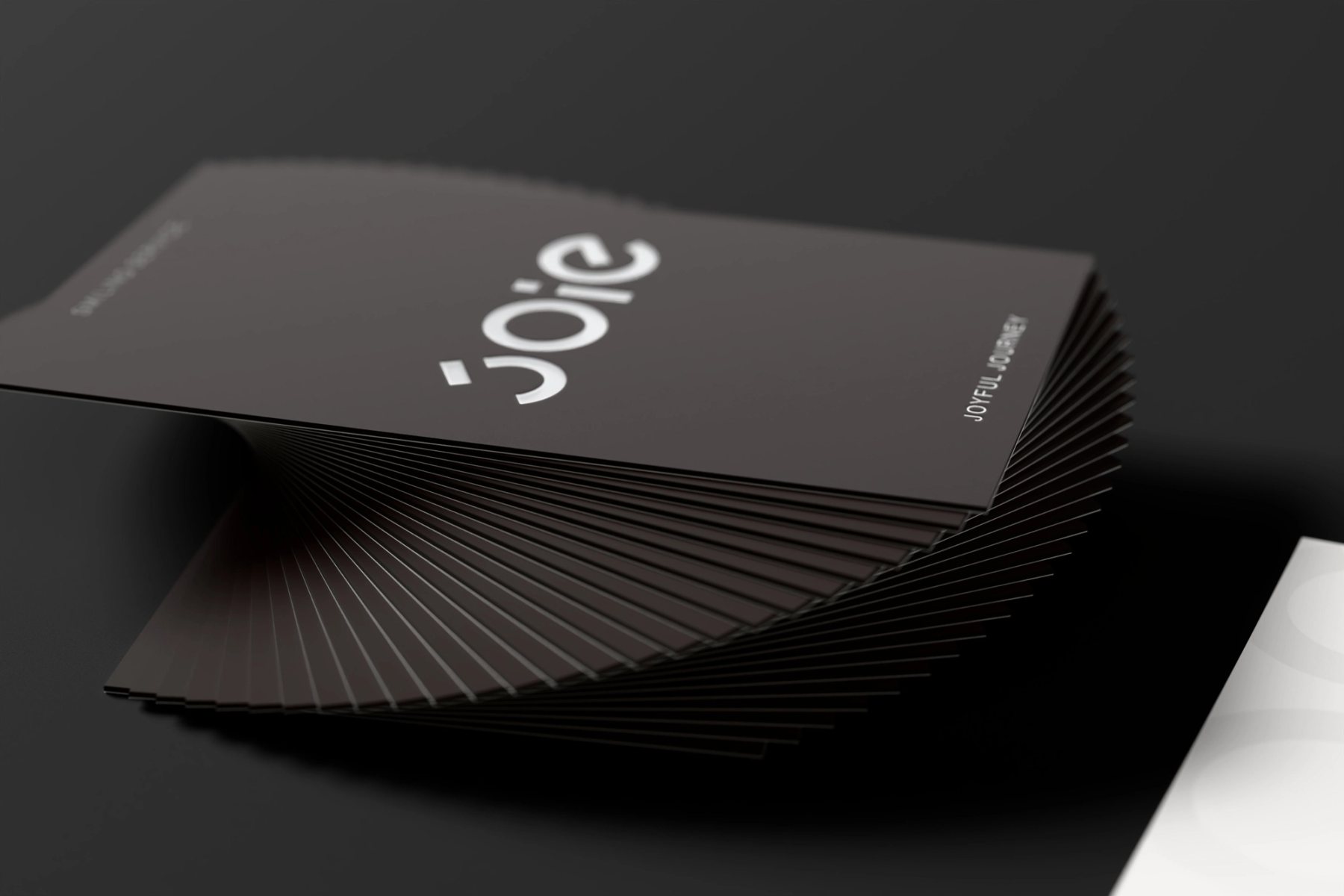
JOIE 商務款黑色名片螺旋堆疊 3D 渲染
Fig.10重複的卡片讓字標與紙邊在堆疊中保持可辨。A repeated stack tests the visibility of the mark and paper edge.
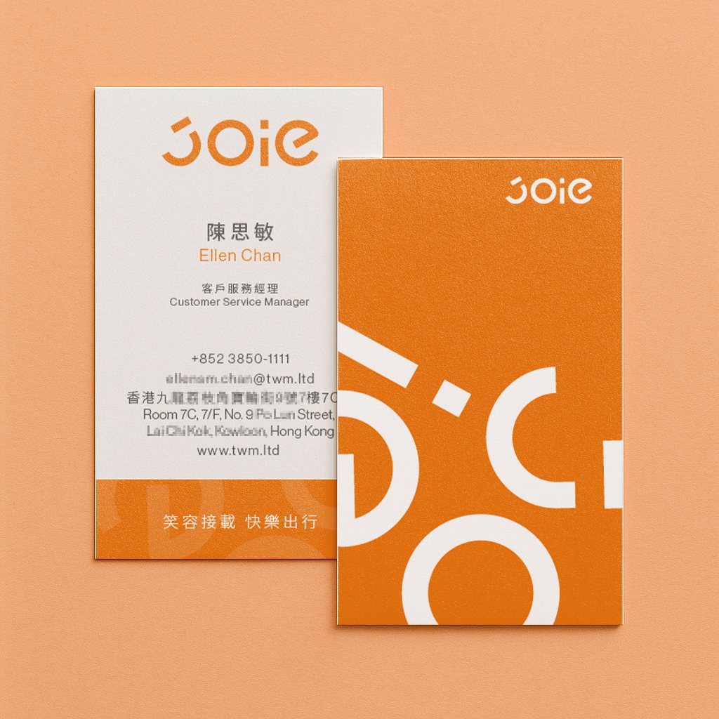
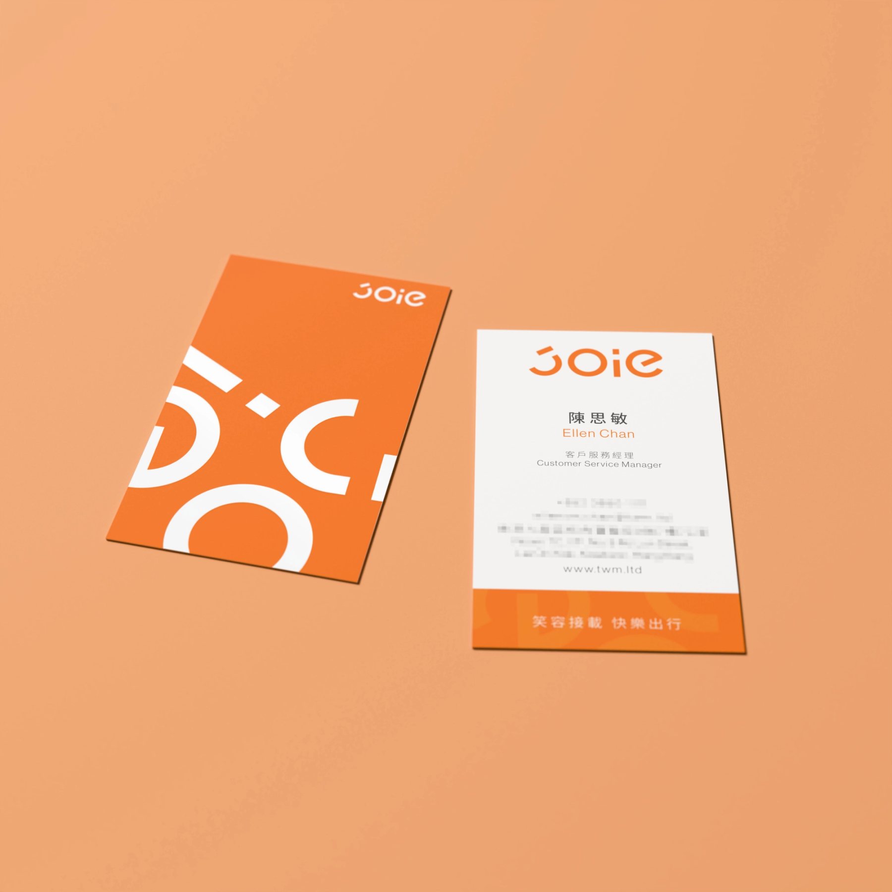
JOIE 品牌活力款橘色名片正反面原稿展示
Fig.1105 品牌活力款|橘色識別面與白色資訊面沿用共同字標。05 Communications | An orange identity side and white information side share the same mark.
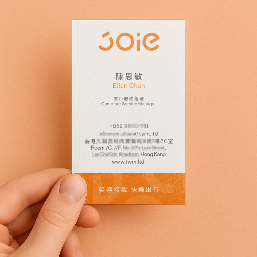
手持 JOIE 品牌活力款橘色名片
Fig.12手持尺度顯示橘色圖形與聯絡資訊的對比。In-hand scale shows the contrast between orange graphics and contact information.
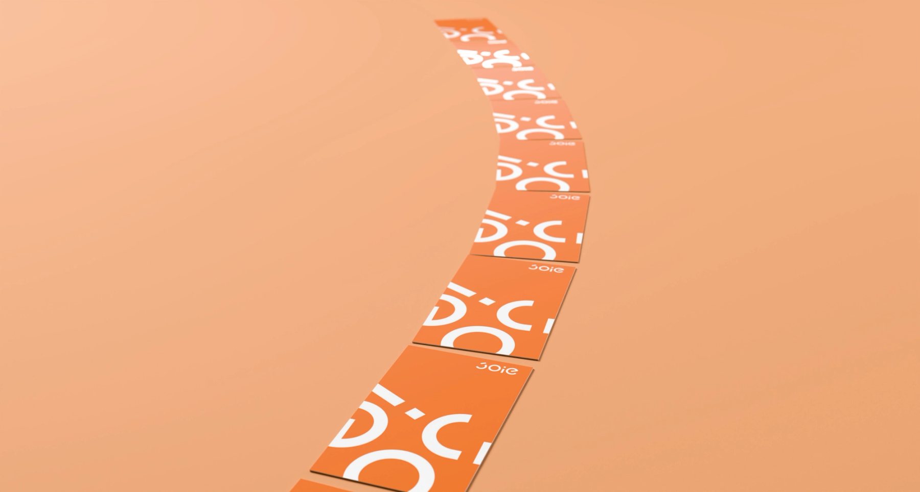
JOIE 橘色名片沿彎道路徑排列的 3D 概念圖
Fig.13放大、裁切的字標沿曲線展開,短槓與圓弧形成道路的節奏。Enlarged and cropped parts of the mark follow a curve; bars and arcs suggest the rhythm of a road.
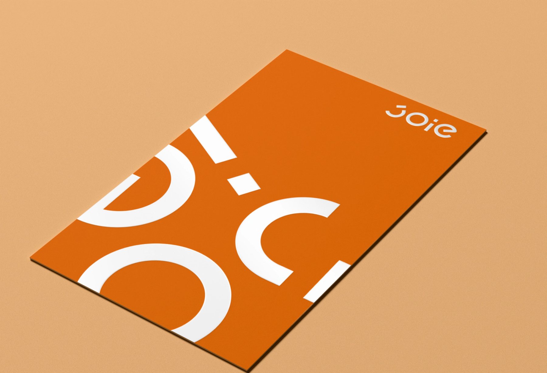
JOIE 品牌活力款橘色識別面與白色資訊面 3D 組合示意
Fig.14橘色識別面集中品牌辨識;資訊回到白底,維持閱讀清晰。The orange side carries recognition; information returns to white for clarity.
JOIE 橘色名片局部上光效果的 3D 示意
Fig.15局部上光的反射帶是工藝提案的 3D 示意,用光差帶出白色圖形。A 3D spot-gloss study uses reflected light to reveal the white graphic.
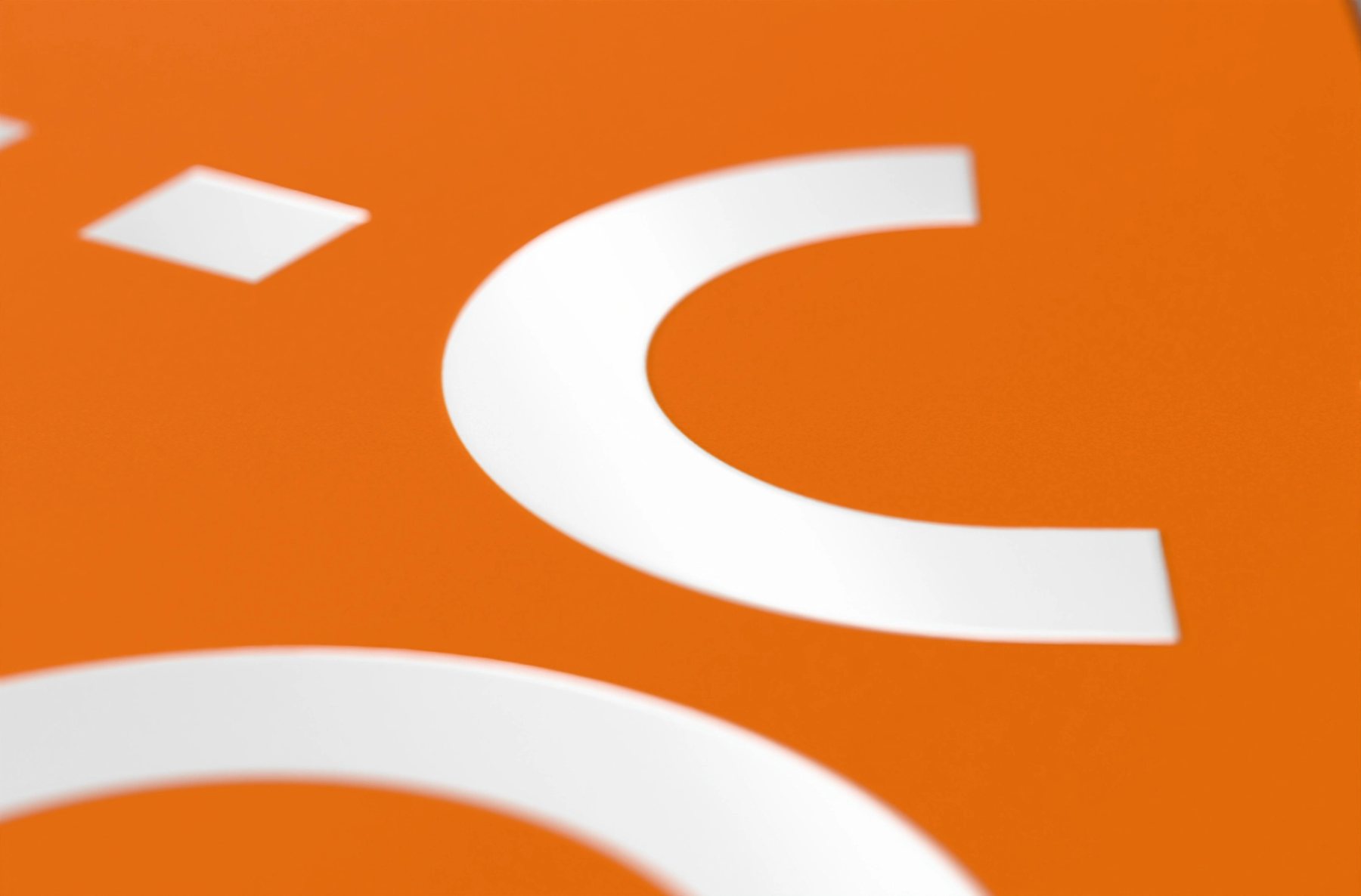
JOIE 橘色名片白色圖形局部上光的微距 3D 示意
Fig.16微距鏡頭檢查霧面橘底與亮面白色圖形之間的差異。A macro view studies the contrast between matte orange and glossy white.
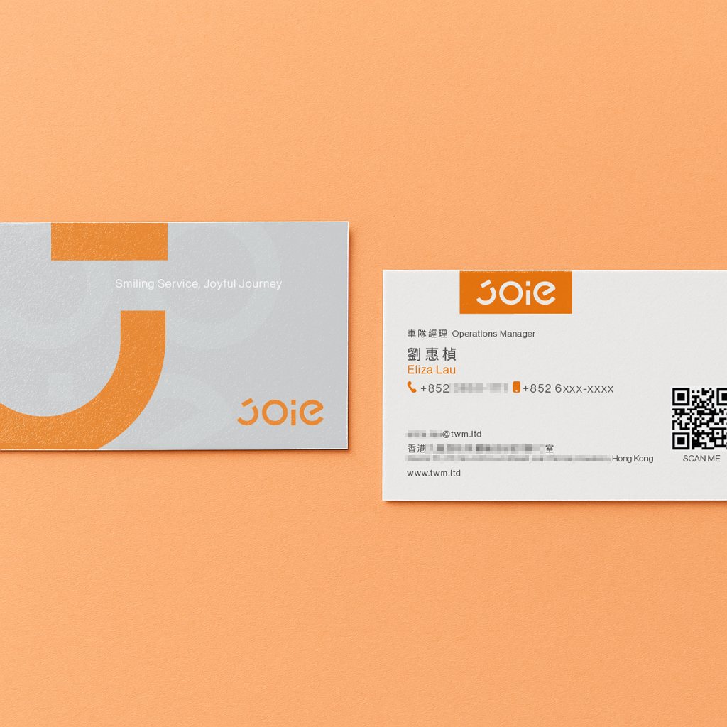
JOIE 服務導向款灰橘名片正反面原稿展示
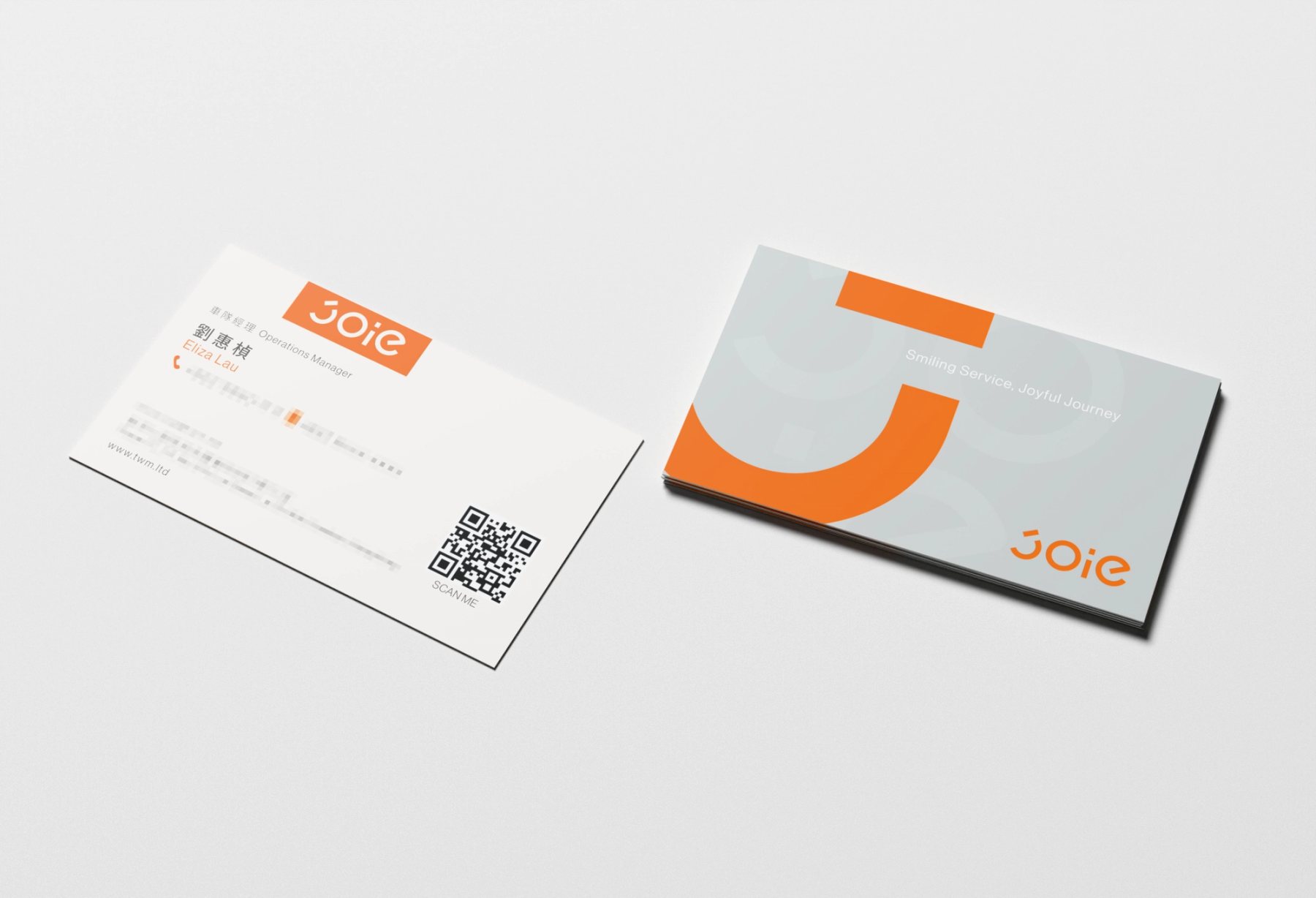
Fig.1706 服務導向款|橘色字標、淺灰圖形與 QR 資訊組成橫式版面。06 Service | Orange mark, pale-grey graphic and QR information form a horizontal card.
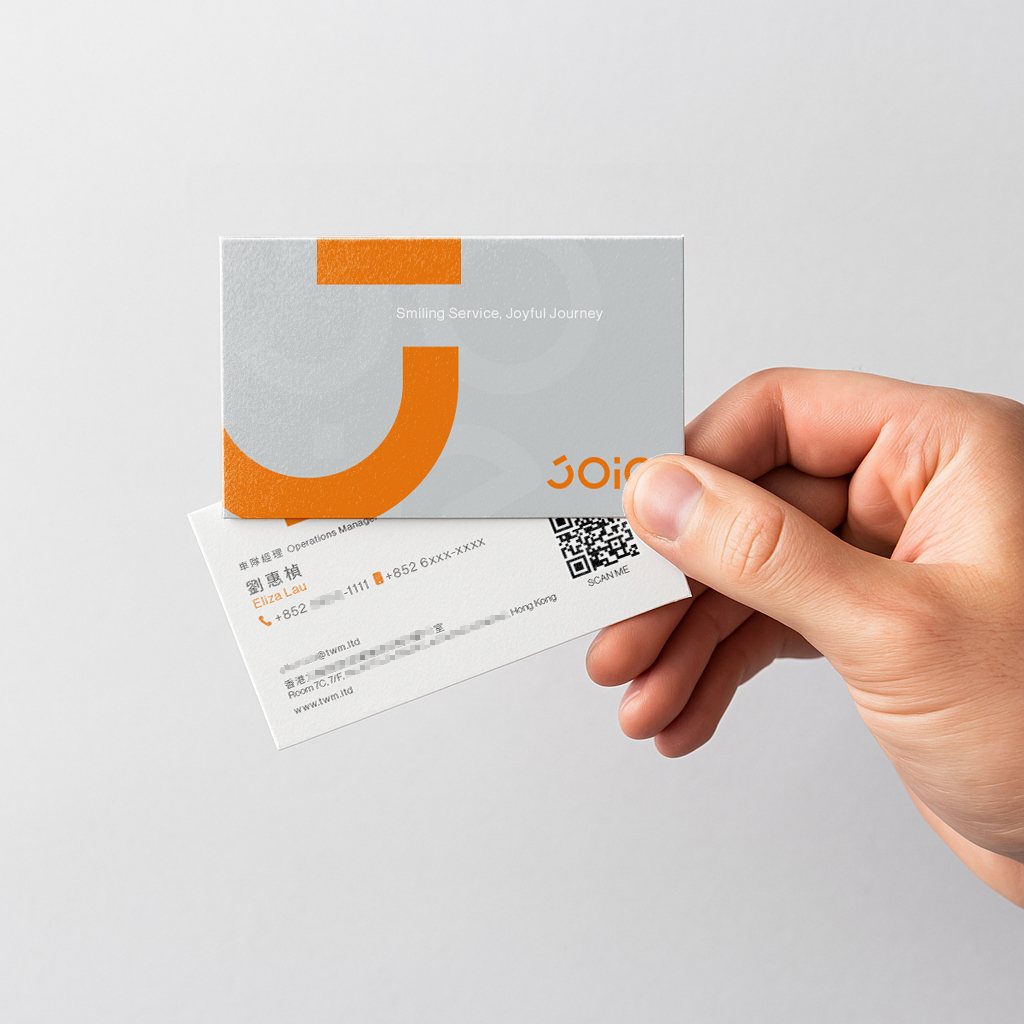
手持 JOIE 服務導向款灰橘名片正反面
Fig.18FIG.06|橫式比例與手持尺度讓服務資訊更容易被定位。FIG.06 | The horizontal proportion and in-hand scale make service information easier to locate.
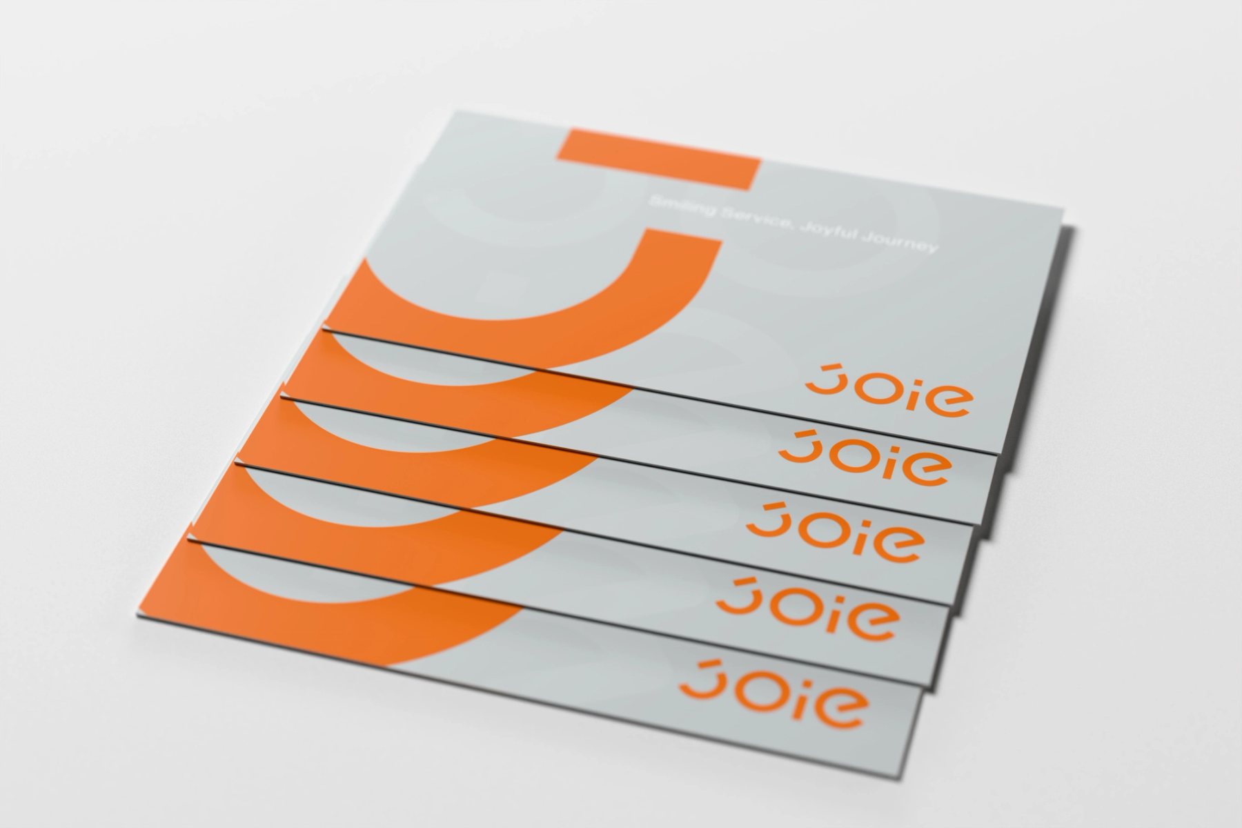
JOIE 灰色服務款名片上揚弧線形成微笑意象的 3D 概念圖
Fig.19字標中向上張開的弧線,在卡片的錯位堆疊中形成連續的微笑。The mark’s upward curve repeats across offset cards as a sequence of smiles.
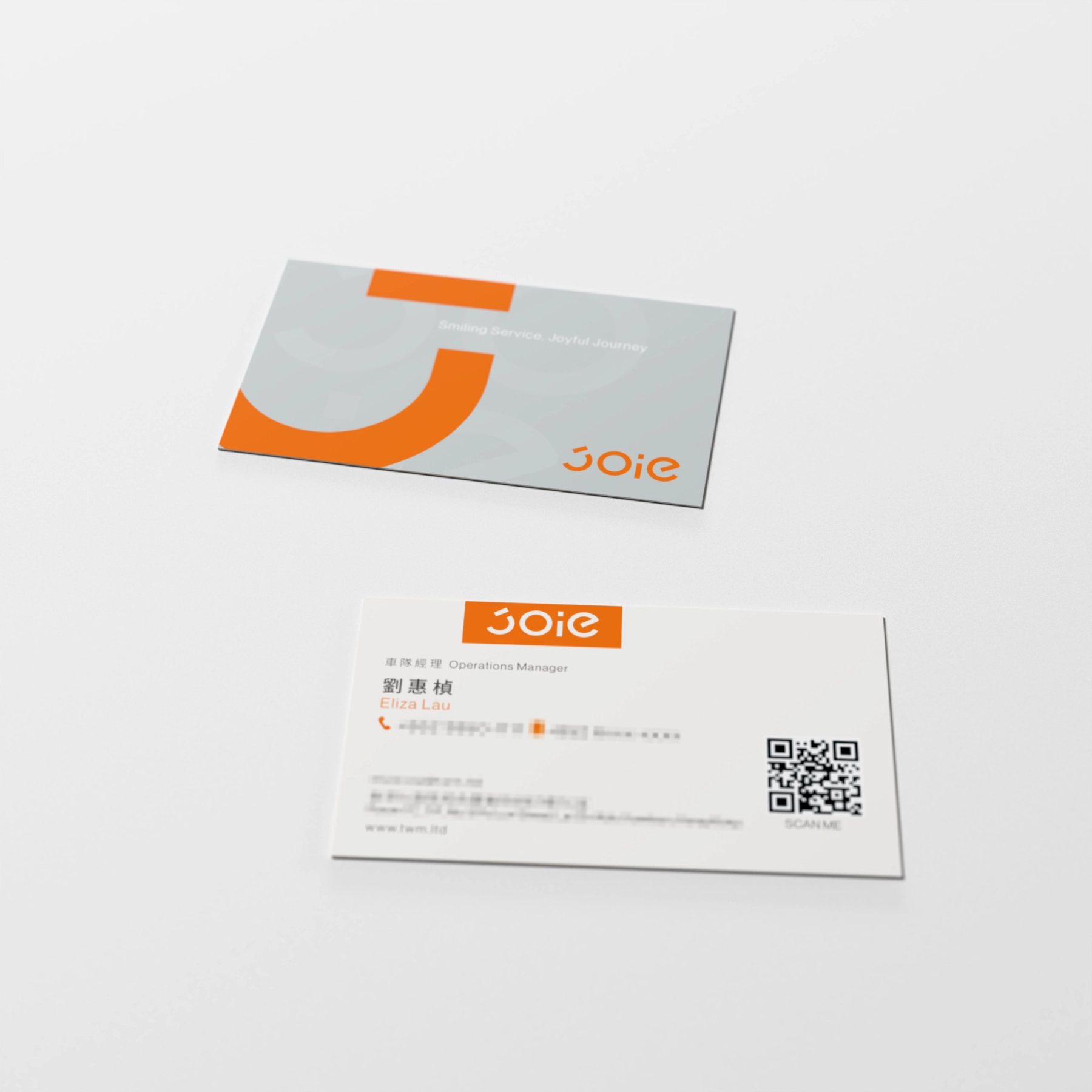
JOIE 服務導向款淺灰識別面與 QR 資訊面 3D 示意
Fig.20淺灰識別面保留輕盈感,QR 與必要資訊集中在另一面。The pale-grey side stays light while the QR code and essential details gather on the reverse.
JOIE 服務導向款橫式名片雙面 3D 示意
Fig.21橫式卡面保留服務資訊的閱讀距離;表面塗佈為視覺化示意。The horizontal card keeps service information legible; the surface coating is a visual study.
JOIE 三款名片燙銀、局部上光與塗佈工藝層級對照圖
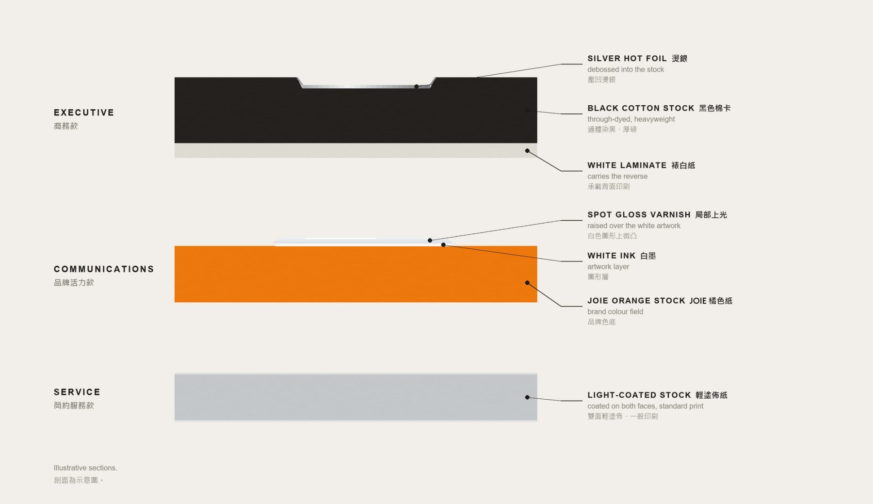
Fig.2207 一套系統|燙銀、局部上光與輕塗佈依角色分配。圖示為材質提案,並非量產規格。07 One system | Foil, spot gloss and light coating are assigned by role. These are proposed finishes, not confirmed production specifications.
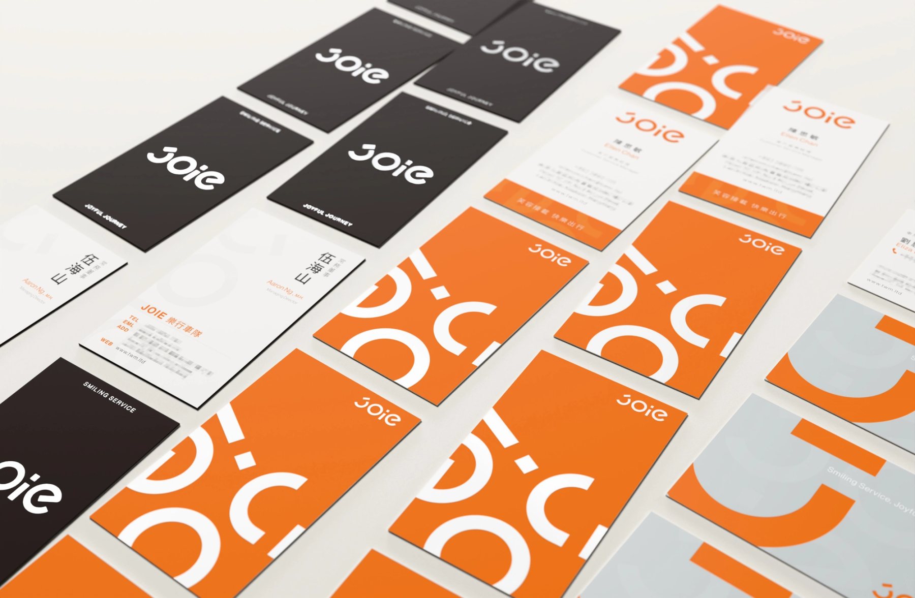
JOIE 黑、橘、灰三款名片以磚形網格排列的 3D 系統圖
Fig.23同尺寸的卡片以磚形節奏排列,測試三款並置時的辨識順序。Cards of the same size form a brick-bond rhythm, testing how the three directions read together.
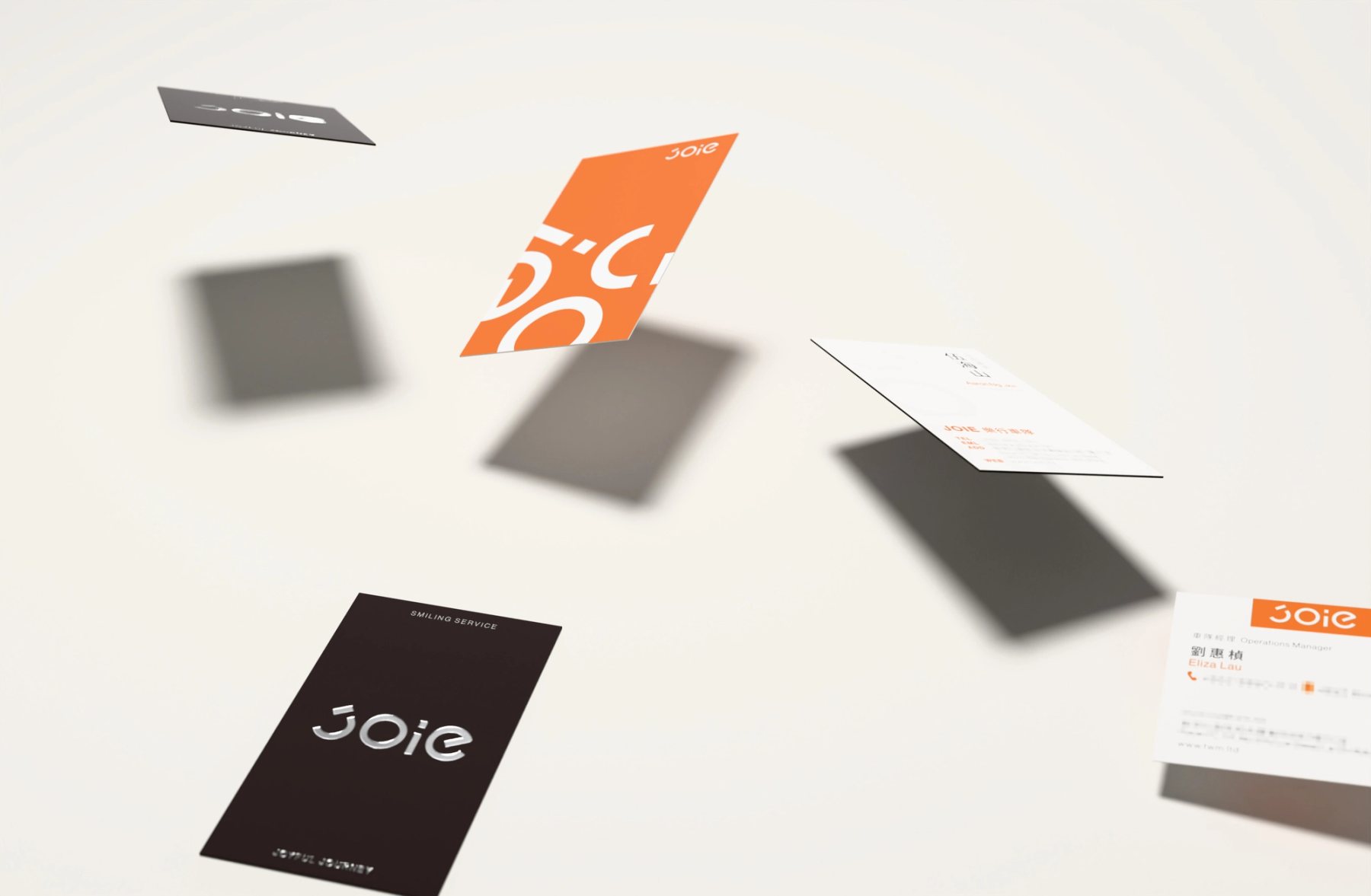
JOIE 三款名片飄落排列的 3D 概念圖
Fig.24角度與距離變化後,共同字標仍維持系列關係。Across varied angles and distances, the shared mark still ties the set together.
JOIE 黑、橘、灰三款名片由深到淺疊瓦排列
Fig.25黑、橘、灰依序轉換,讓角色差異在同一視覺節奏中出現。Black, orange and grey shift in sequence while retaining one visual rhythm.
JOIE 三款名片紙張與表面加工的示意剖面圖
Fig.26紙層、切邊與表面加工的剖面為 3D 示意;厚度與加工深度並非印廠量測。Illustrative sections show paper layers, edges and finishes. Thicknesses and depths are not measured production data.
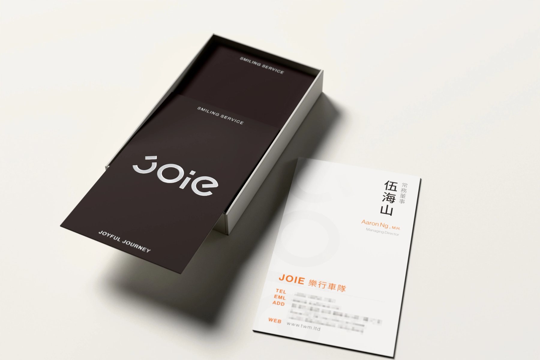
JOIE 名片由名片盒取用的 3D 情境圖
Fig.2708 使用情境|從名片盒取出時,識別面先被看見。08 In use | The identity side appears first when a card is taken from the box.
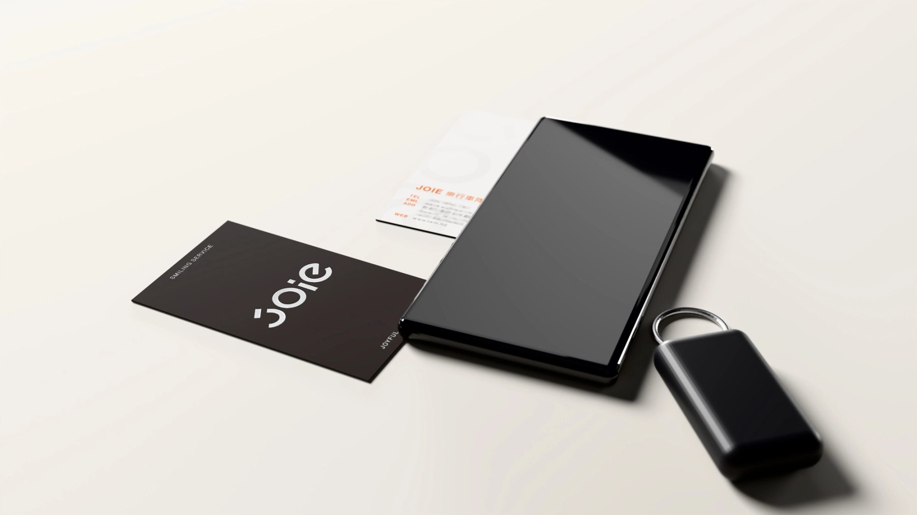
JOIE 三款名片放置於會議桌的 3D 情境圖
Fig.28並置在桌面上,三款方向仍以同一個品牌辨識相連。Placed together on a table, the three directions remain recognisably JOIE.
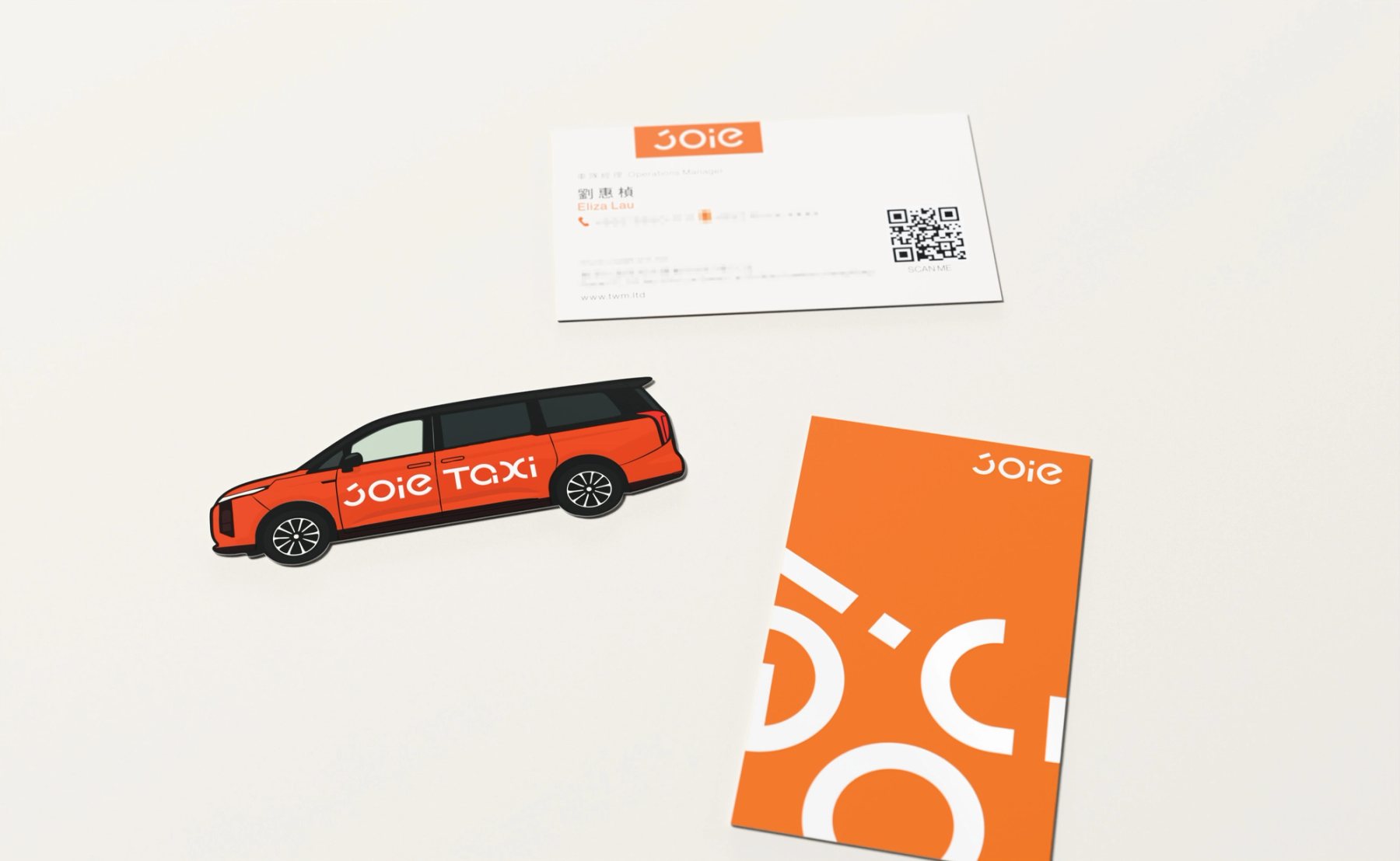
JOIE 名片識別與車型造形名片並置的 3D 結尾圖
Fig.2909 延伸|共同的 JOIE 字標與橘色,延續至車型造形名片。09 Beyond the card | The JOIE mark and orange continue into the vehicle-shaped card series.